A visually appealing and well-organized storefront is essential for any online business. It builds trust with customers and can significantly improve your conversion rates.
The Spree theme editor provides a powerful, no-code, drag-and-drop page builder that allows you to visually design your storefront, reflect your brand identity, and preview changes in real time - without writing a single line of code or hiring developers.
How to Edit Your Theme
To edit your storefront’s theme, navigate to Storefront → Themes in the admin dashboard.
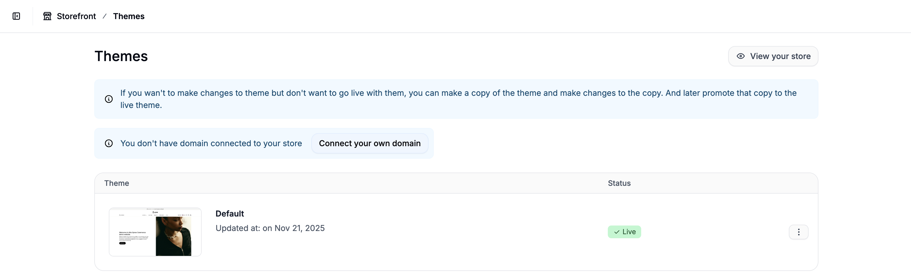 Find the theme with the status Live and click on it to open the theme editor.
It’s useful to note before we go further that you should always click Publish in the top-right corner to save your changes. Leaving the editor without publishing will discard all unsaved edits.
Top Navigation
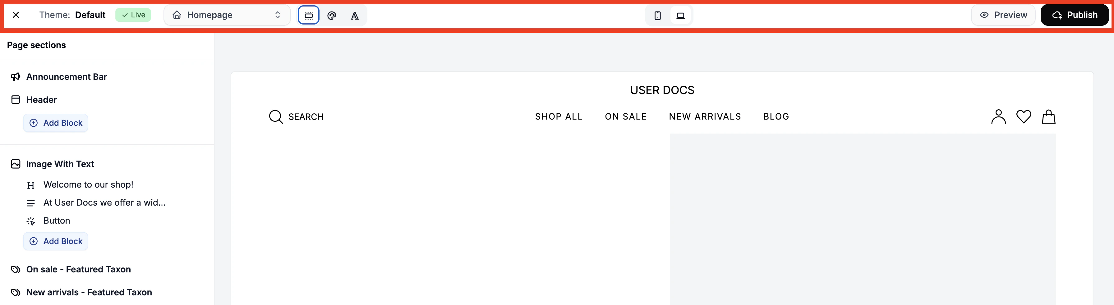 The top navigation bar allows you to switch between pages, adjust global settings, and preview different views of the storefront.
This gives you access to the following controls and settings:
The top navigation bar allows you to switch between pages, adjust global settings, and preview different views of the storefront.
This gives you access to the following controls and settings:
Page Selector
 In the top-left dropdown, choose which page you want to edit. The editor will reload with the selected page’s layout and elements.
Color Scheme
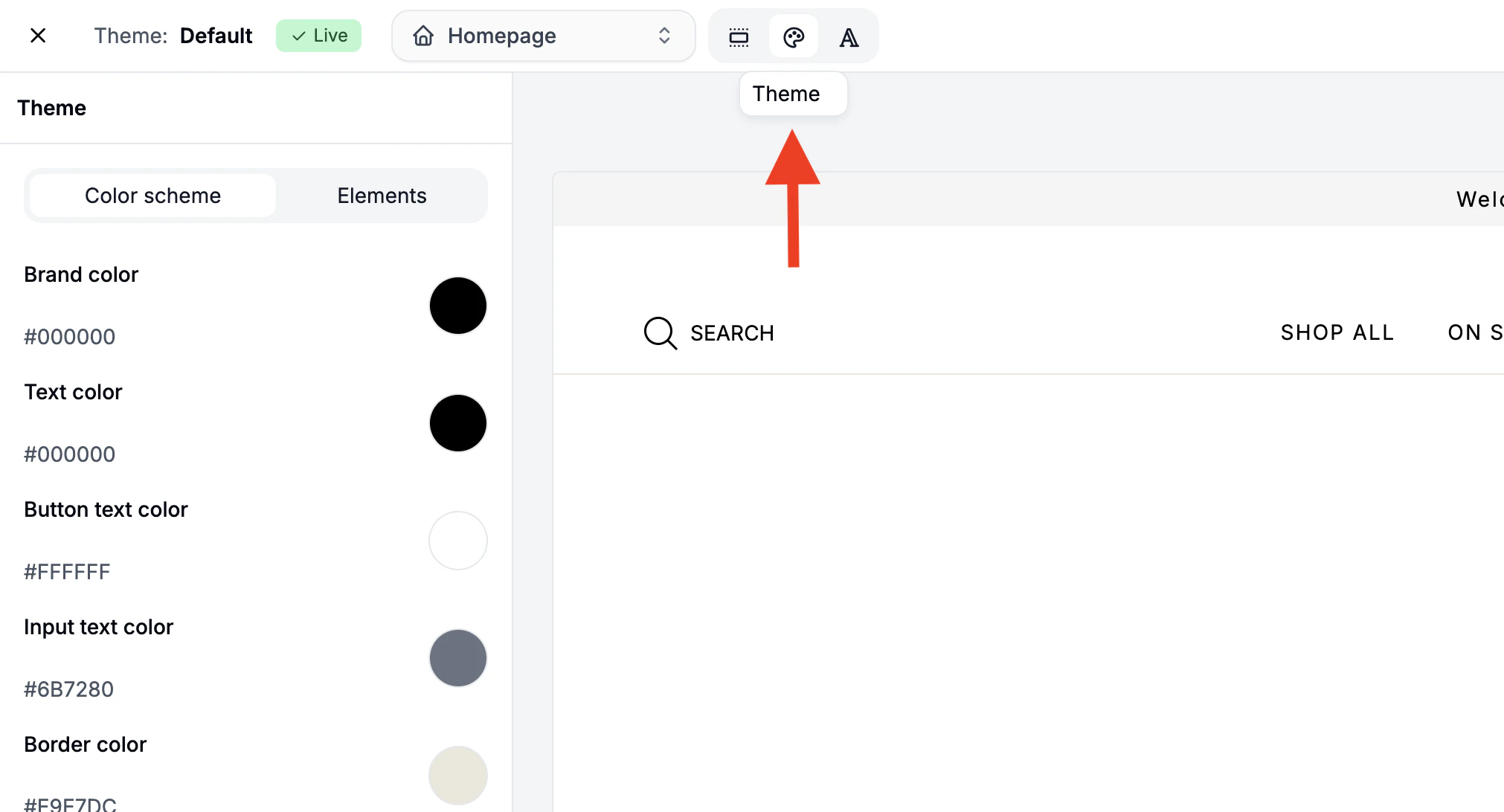 Click the palette icon to open the global color settings. You can change the default colors used across all pages.
Click any colored circle to open the color editor, where you can:
Click the palette icon to open the global color settings. You can change the default colors used across all pages.
Click any colored circle to open the color editor, where you can:
- Enter a hex code manually
- Adjust the hue and saturation
- Control transparency using the right-hand slider
Fonts
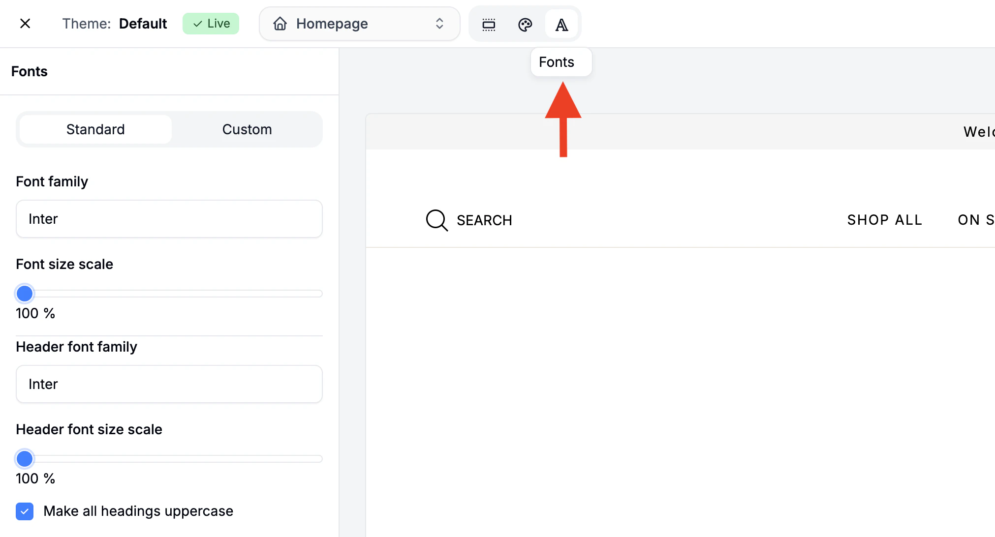 Click the A icon to change fonts. You can choose from:
- Standard Fonts - Select separate font families and sizes for body text and headings using dropdowns and sliders.
- Custom Fonts - Add custom fonts by pasting the embed and style code.
Views
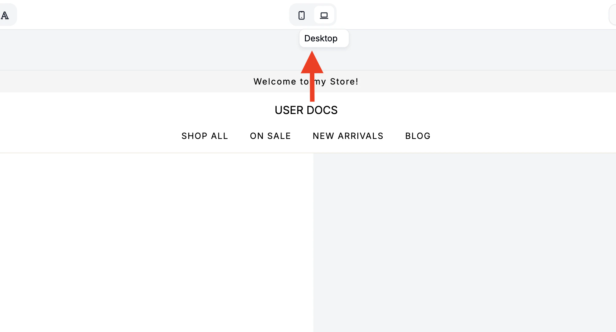 Located in the middle of the
- Mobile View - Preview how the storefront looks on mobile devices.
- Desktop View - Preview how the storefront looks on desktop devices.
Side Navigation
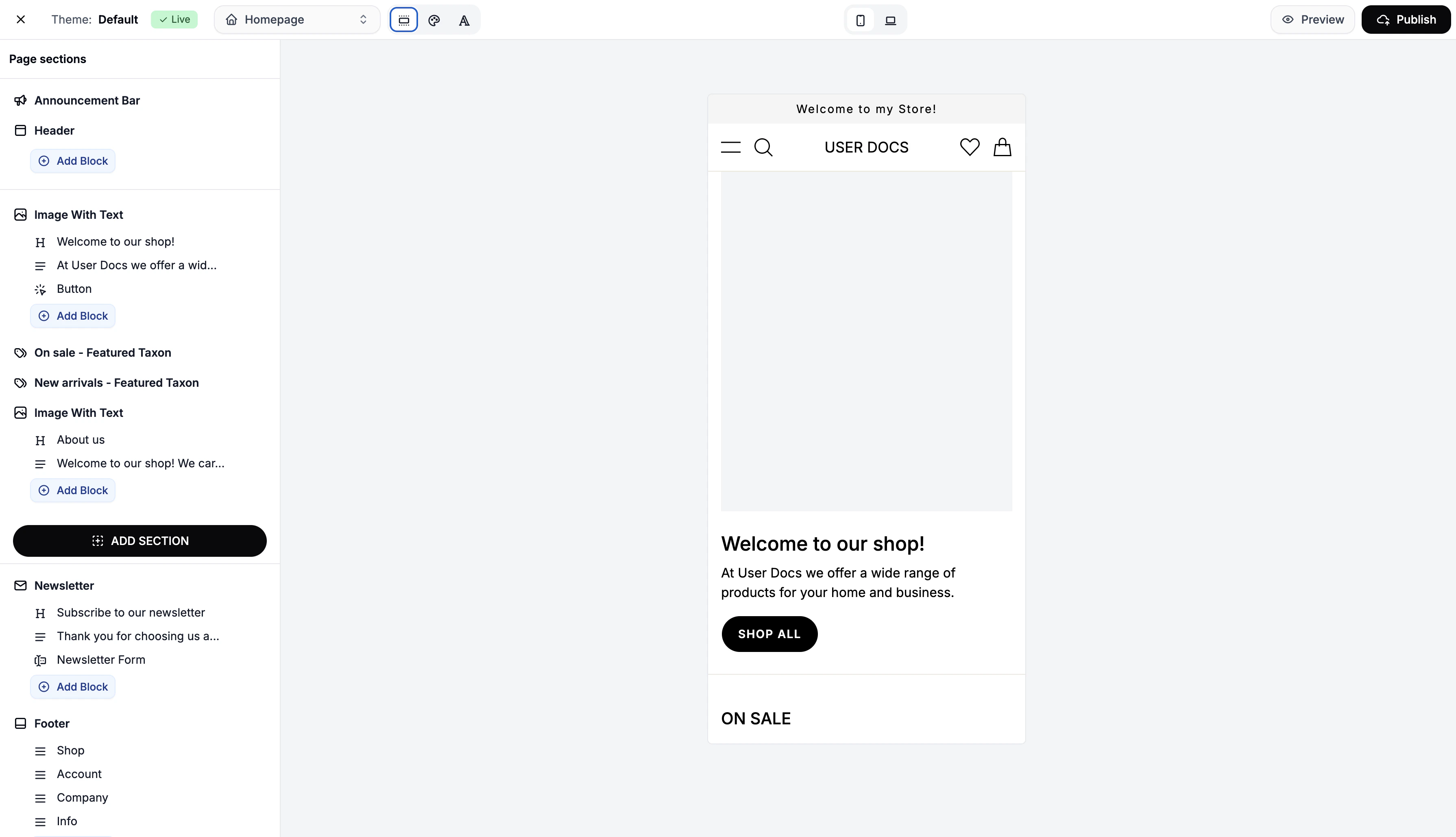
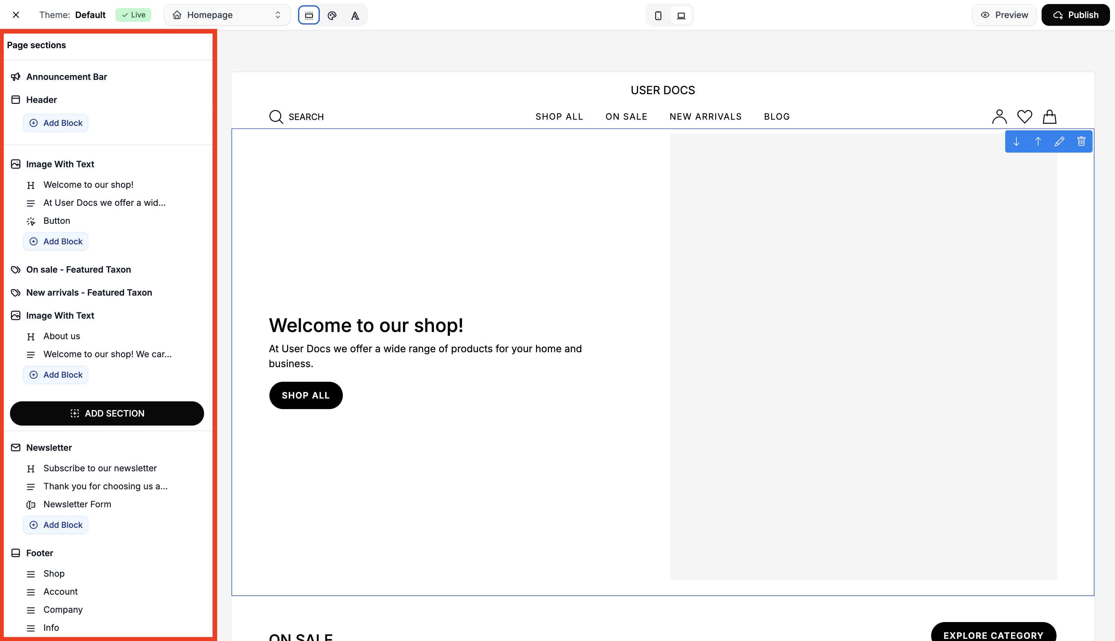 The side navigation allows you to add, configure, and arrange page sections and individual content blocks.
Page Section Settings
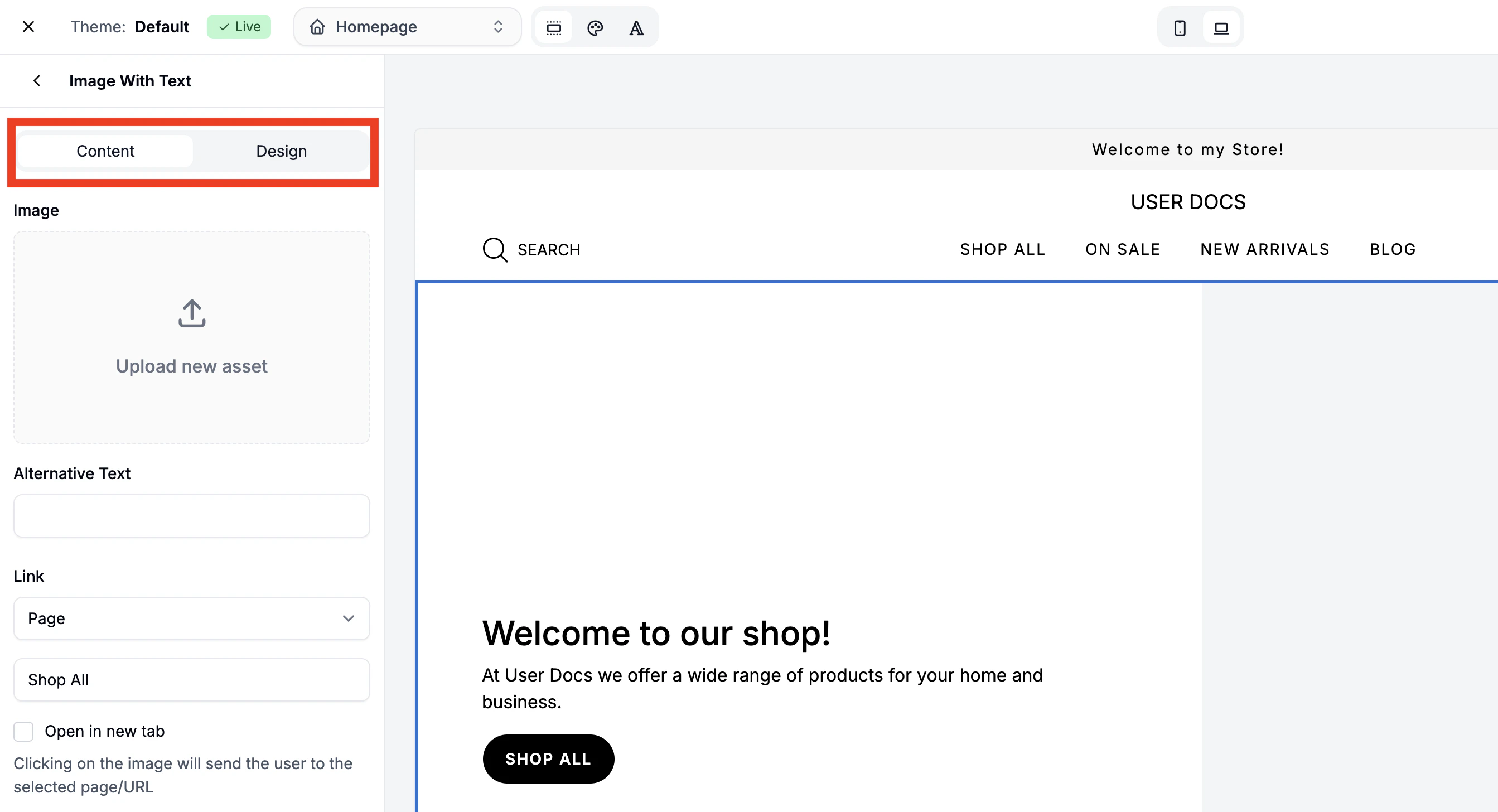 Click on any page section or element to configure its content and appearance. Most page sections have two distinct tabs:
- Content Settings - Edit text, links, images, and other content
- Design Settings - Change padding, borders, alignment, color, and sometimes layouts
Global Page Sections
Global sections appear across every page (besides checkout) and update everywhere when edited. They can be modified via the Side Navigation. Global page sections are as follows:
Announcement Bar
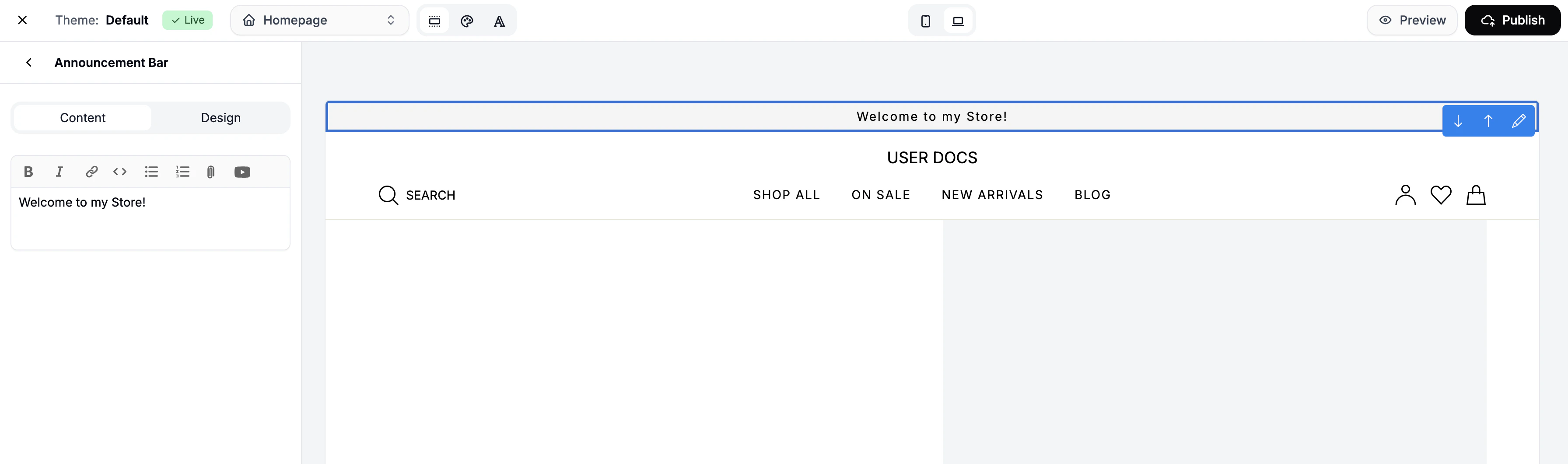 Add a message that appears at the very top of every page. Ideal for welcome messages and promos like free shipping or limited-time discounts.
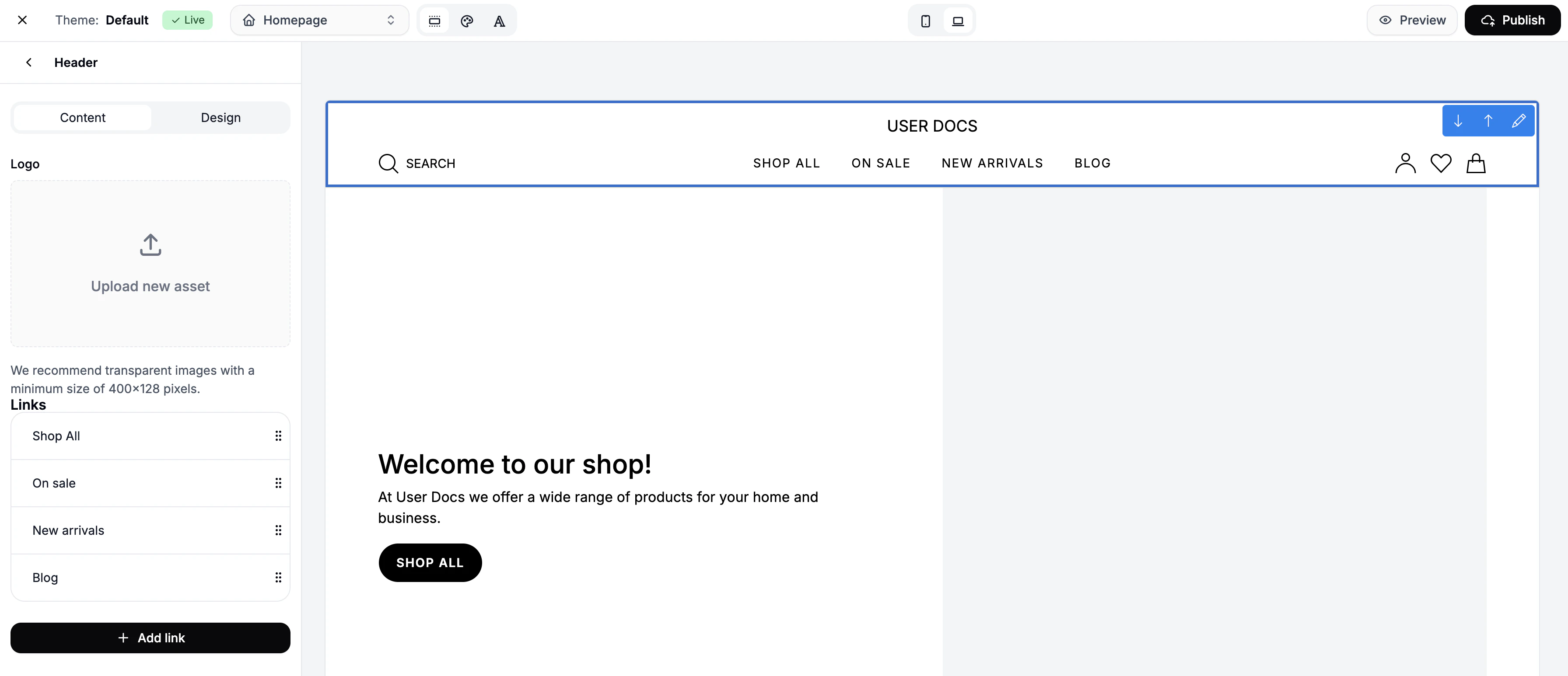 The header includes your:
- Logo
- Navigation links
- Search bar
- Cart icon
- Account menu
Add Logo
Click Header and upload your logo. You can resize its presentation in the Design tab.
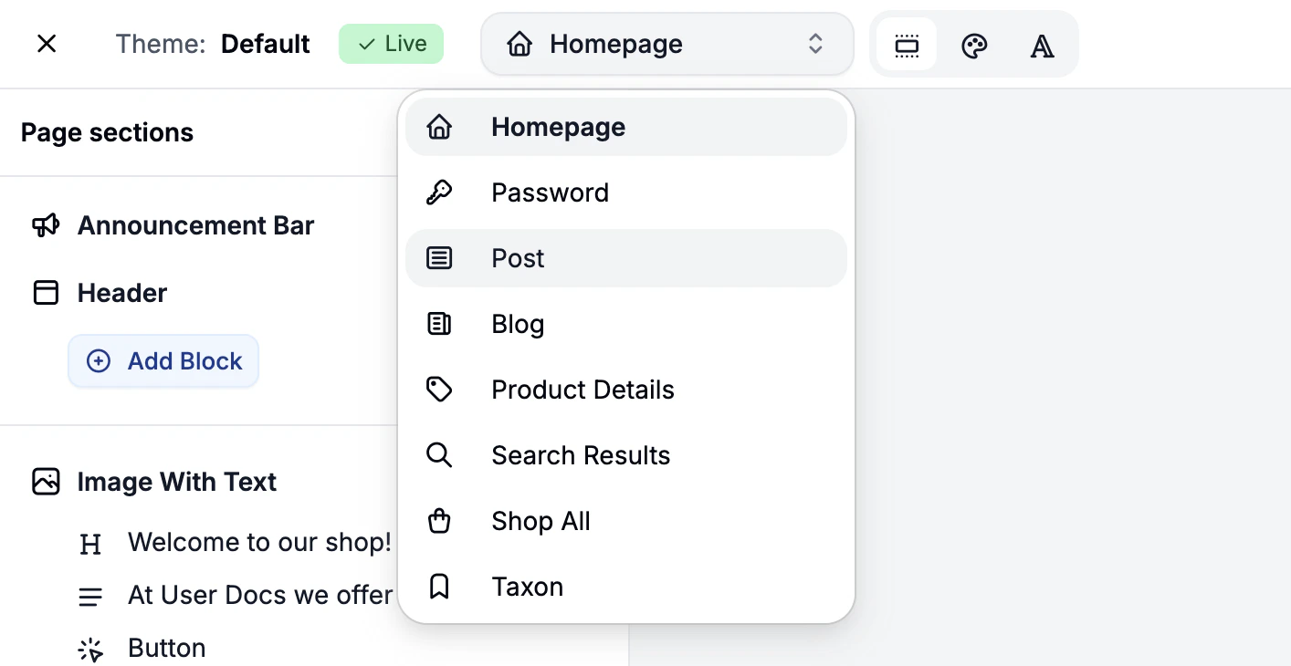
Add Links
Click Add Link to add navigation items.
Link Types are as follows:
- Page (e.g. About Us, Blog)
- Product
- Post (blog)
- Taxon (category)
- Policy (e.g. Terms)
- URL (external or internal)
You can also choose to have the link open in a new tab.
Add Blocks
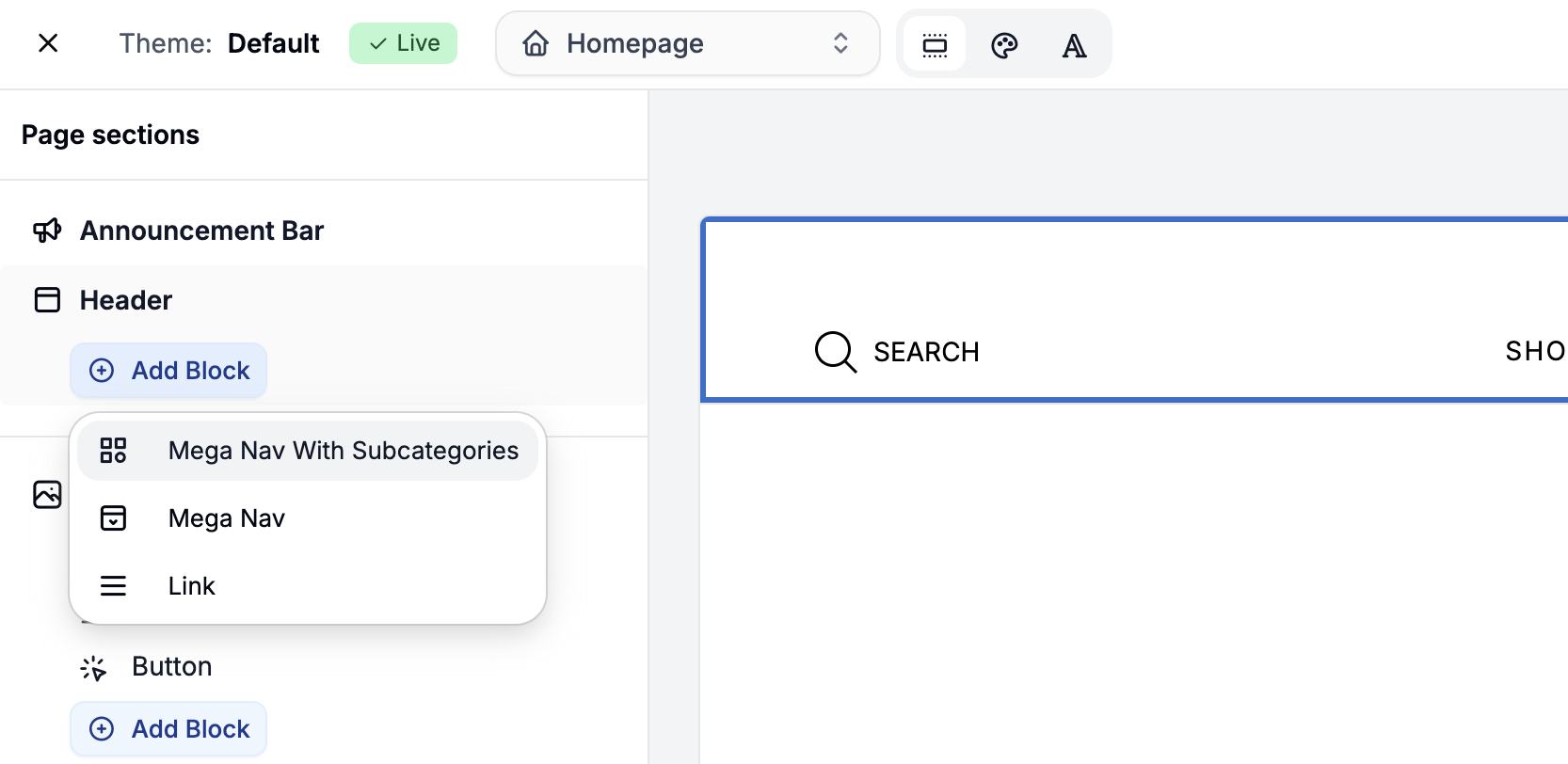 Click Add Block to configure a more advanced header layout. You can select from the following block types:
- Mega Nav with Subcategories - Add a dropdown menu populated from a chosen taxon and its subtaxons. Optionally feature a highlighted taxon with image.
- Mega Nav - Manually add links to columns within a dropdown layout for full control over structure.
- Link - A simple link to taxon, product, policy or any other page.
Newsletter
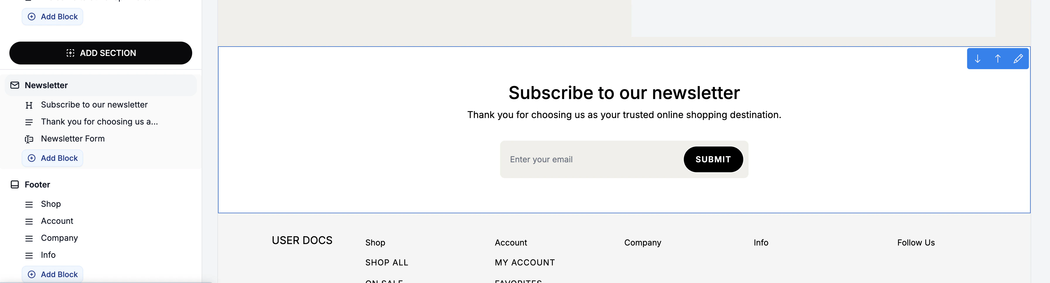 A global email capture section to build your subscriber list. Customize text and styling as needed.
 Add:
Add:
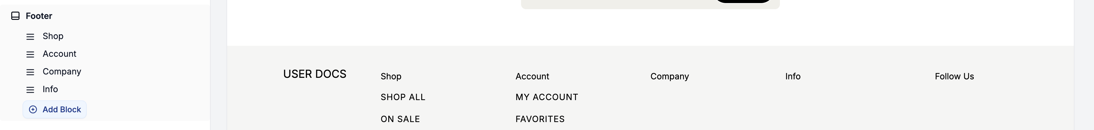
- Your logo
- Policy links
- Product category links
- Social media links
Organize content into blocks using Add Block, and add links as you did in the Header section.
Page-Specific Sections
These only appear on the page they’re added to - ideal for storytelling, product discovery, and homepage content.
Add Page Sections
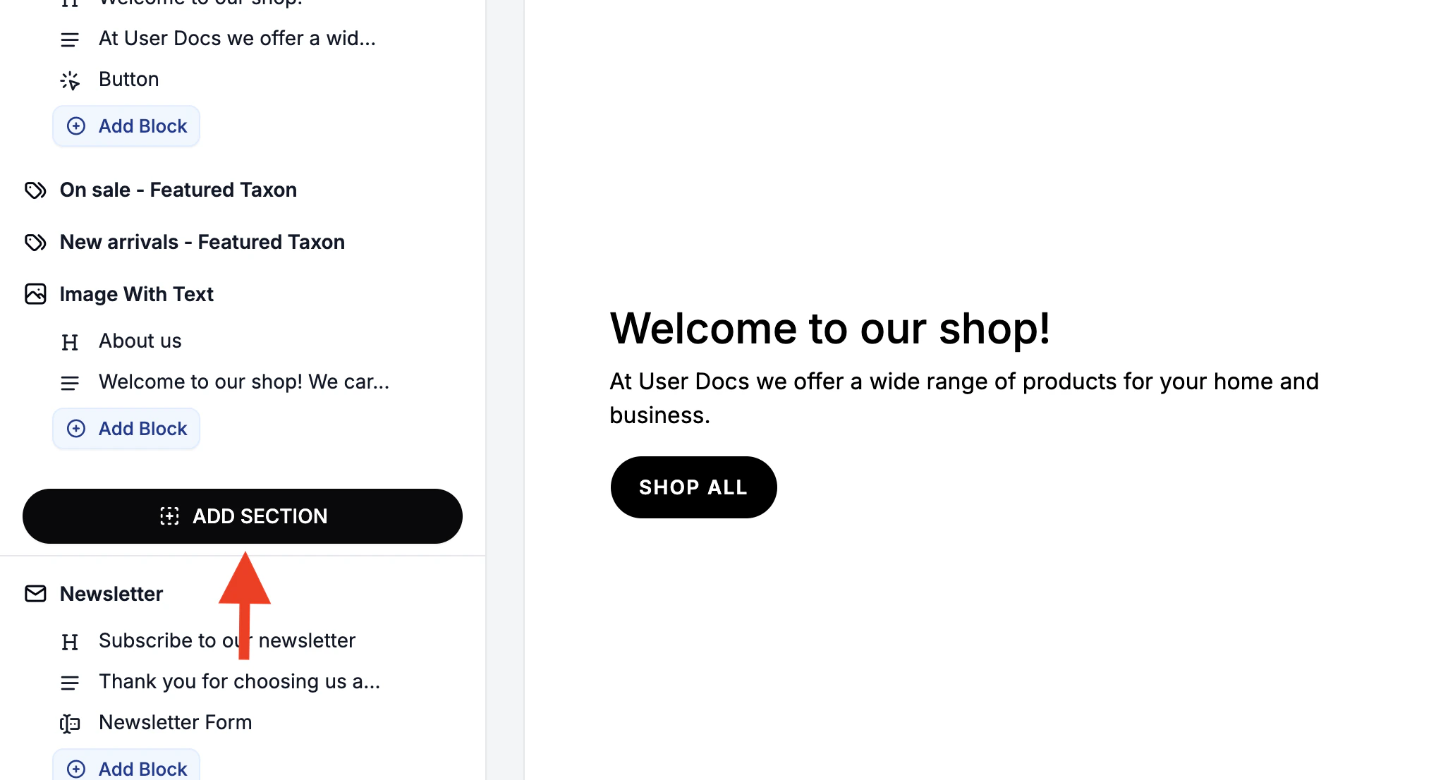 Click Add Section in the sidebar, then choose a layout type from the following options:
- Breadcrumbs
- Custom Code
- Featured Posts
- Featured Product
- Featured Taxon
- Featured Taxons
- Image Banner
- Image With Text
- Page Title
- Related Products
- Rich Text
- Video
The newly added section will appear at the bottom of the page, but above the footer and newsletter.
Edit Page Sections and Elements
Click on a section in the sidebar or directly in the preview to update content or design. All changes reflect immediately in the editor preview.
Rearrange Page Sections and Elements
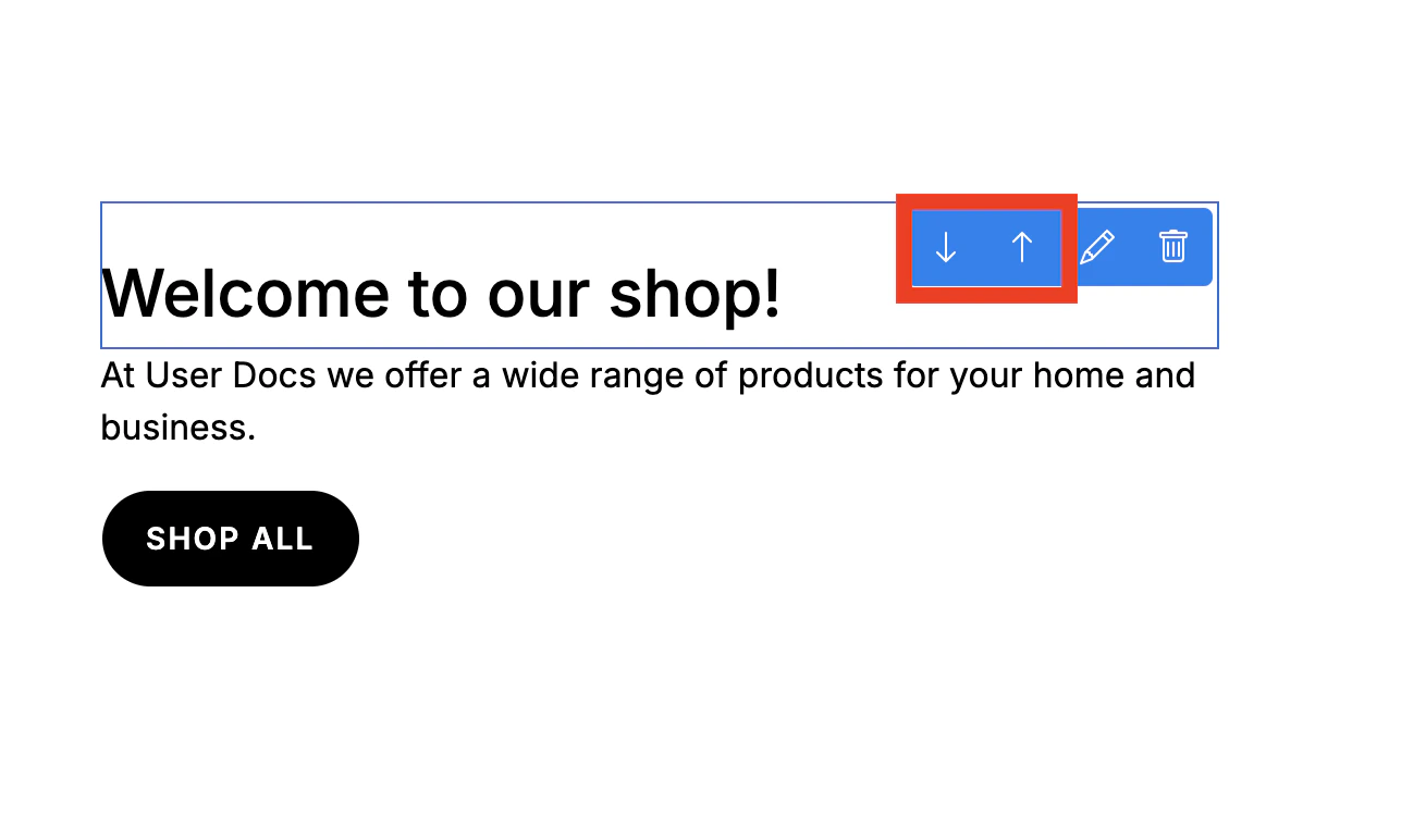 To move a page section or element, hover over it in the preview to reveal the actions menu, then use the up and down arrows to reposition it to the desired location on the page.
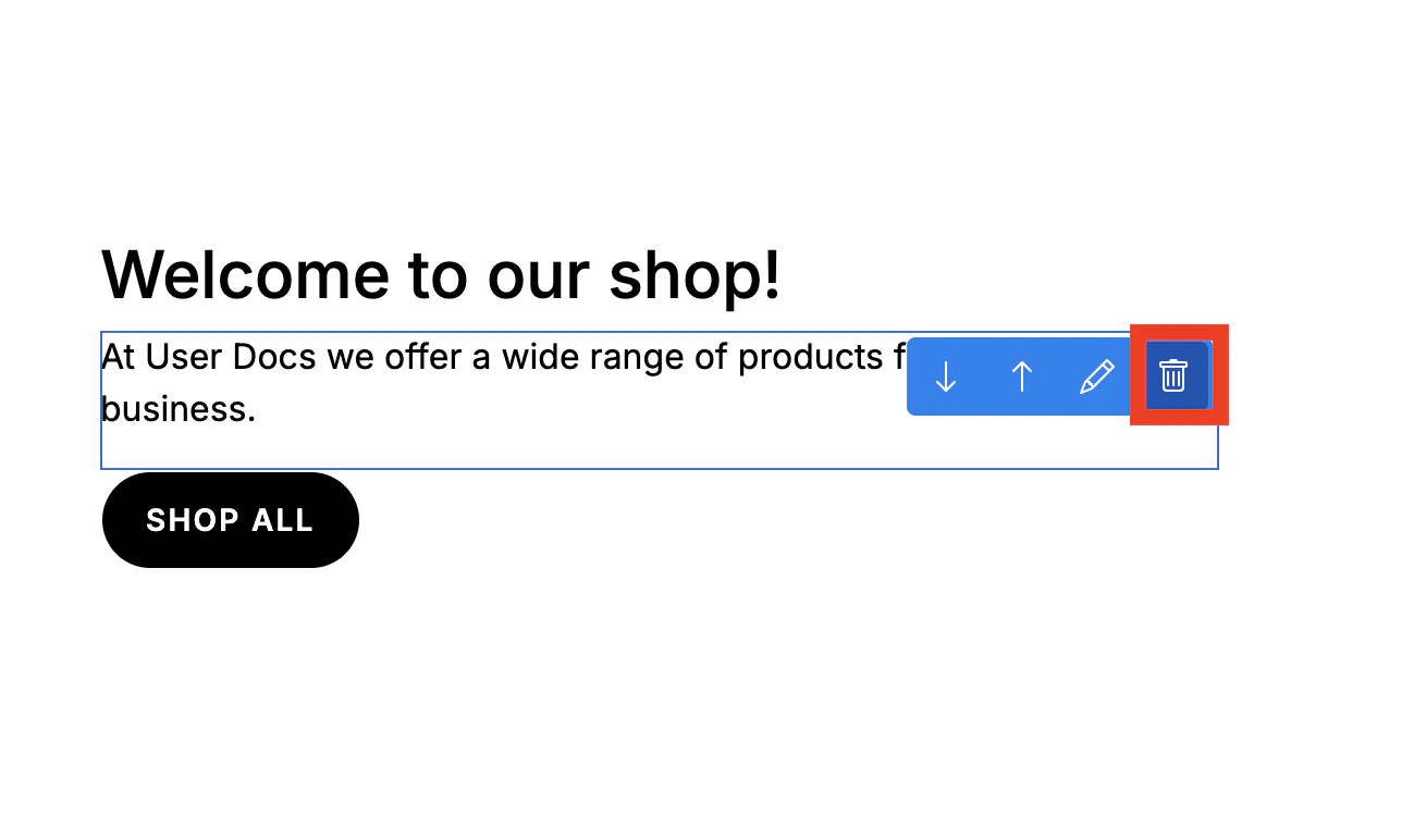
Delete Sections and Elements
 You can either:
- Select a section and click Delete at the bottom left of the side navigation
- Hover over an element in the preview and click the trash can icon
Publish
Once you’re finished modifying your storefront theme, click Publish in the top right corner to save and apply your changes to the live storefront immediately.
Any changes you make in the editor are not saved until you click Publish. If you do not wish to save your changes, simply back out of the theme editor.