Ecommerce UX best practices and trends
What is UX
User experience (UX) is about the user’s perception of your product, service, or website and emotions associated with it. While it applies to all the aspects of the user’s customer journey, from the product itself, packaging, delivery, and customer service, the key part for ecommerce is the positive experience on your website. Otherwise, the user will not convert into a customer and will never get a chance to experience the other touchpoints.
We can say that user experience is about evoking positive emotions as well as helping our potential customers to achieve their goals as quickly and smoothly as possible.
Why is good UX important for ecommerce websites
Great user experience on your website will:
- Drive conversions
Your website pages are a path leading to the desired outcome – the sale. The more users you lose on the way, the fewer transactions you will get.
- Improve customer retention and earn referrals
Happy customers are not only more likely to return to shop in your store, but also recommend it to others.
According to the CEO of Amazon, Jeff Bezos:
“If you build a great experience, customers tell each other about that. Word of mouth is very powerful.”
- Boost average order value
Upselling, cross-selling, and product recommendations done right can help you increase the value of the average purchase in your store. Thoughtful implementation of these techniques not only leads to more sales, but it also enhances the relationship you have with customers when you suggest items or upgrades they enjoy and find useful.
- Bring more organic traffic
Google and other search engines’ algorithms are designed to favor websites that are valuable and friendly to users. This means that the application of user experience (UX) best practices have been rolled into SEO and impact your website positions in the search results.
- Help distinguish your brand from the competition
Whatever your competition’s online presence is, you cannot afford to stay behind. Great UX may help you make potential customers choose your store over theirs. Use it to your advantage.
- Result in long term gains
To sum up, better user experience means higher revenue due to an increase in conversion rate and customer lifetime value, as well as, marketing costs reductions thanks to better SEO, brand loyalty, and word of mouth.
UX best practices for ecommerce
- You have only 50 milliseconds to make a good first impression
People make snap judgments. It takes only 1/10th of a second to form a first impression about a person. We’re even faster when it comes to websites. A few years ago, Google confirmed in its research that it takes about 0.05 seconds for users to build an initial “gut feeling” about your website. And that determines whether they’ll stay or leave.
To make them stay, your website’s design needs to capture their interest instantly as well as evoke the desirable emotions. Once you have managed that, they are more likely to stay for a longer time. And the longer they stay, the more likely they buy!
“The probability of leaving is very high during the first few seconds because users are extremely skeptical, having suffered countless poorly designed web pages in the past. People know that most web pages are useless, and they behave accordingly to avoid wasting more time than absolutely necessary on bad pages.” – according to a study by Nielsen Norman Group
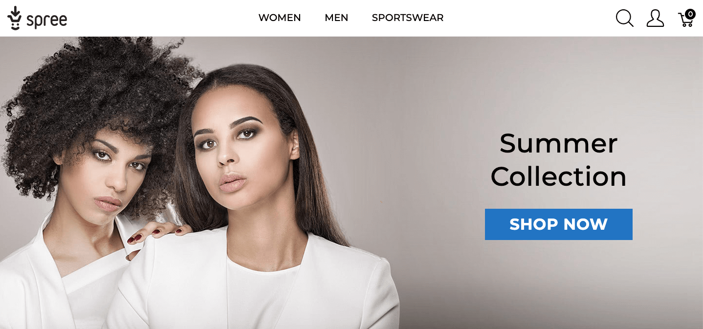
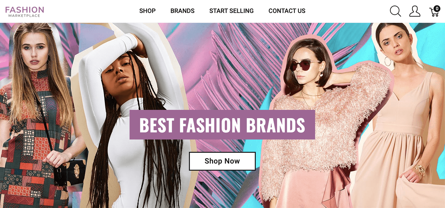
Tip: Use beautiful visuals that evoke the desired emotions in your target group, a clear message and a Call To Action (CTA)
- Experience focused
-
- Functionality over Beauty
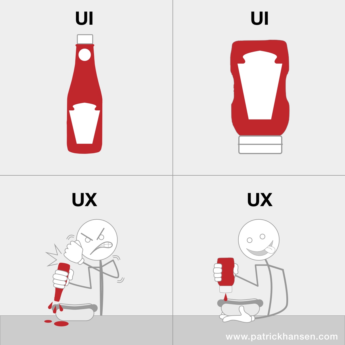
However, UX is not only about the visual beauty of your website. User experience is much more than that. An eye-pleasing User Interface (UI) is important but it is only one step in the process. Even the most beautiful website, that has terrible usability (ease of use), can turn the overall experience into a nightmare.
-
- Simplicity and familiarity
People love simple and familiar designs. According to the less is more trend, well-made minimalistic and uncluttered websites are preferred by users. Though intricate UI might look great, however, it won’t help if the users don’t know how to handle the website or cannot find what they’re looking for quickly and with no unnecessary effort.
- Intuitive design
Intuitive design means that when users see it, they know exactly what to do. People are used to certain website layouts in ecommerce and have specific expectations about where to find certain elements and how they should look like. If your online store doesn’t match the users’ mental image of an ecommerce site, they will find it hard to use – unintuitive.
“Intuitive design is invisible; non-intuitive design disrupts.”
Here are the key elements that you should pay attention to when designing an intuitive ecommerce website:
-
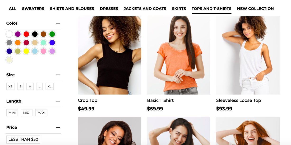
- Easy navigation: menu, search, filters
Your users should be able to find easily and quickly what they are looking for. This can be achieved with a clear and esthetic megamenu, internal search engine as well as relevant filters that help users preview only the products that interest them.
-
- Product Listing Pages (PLPs)
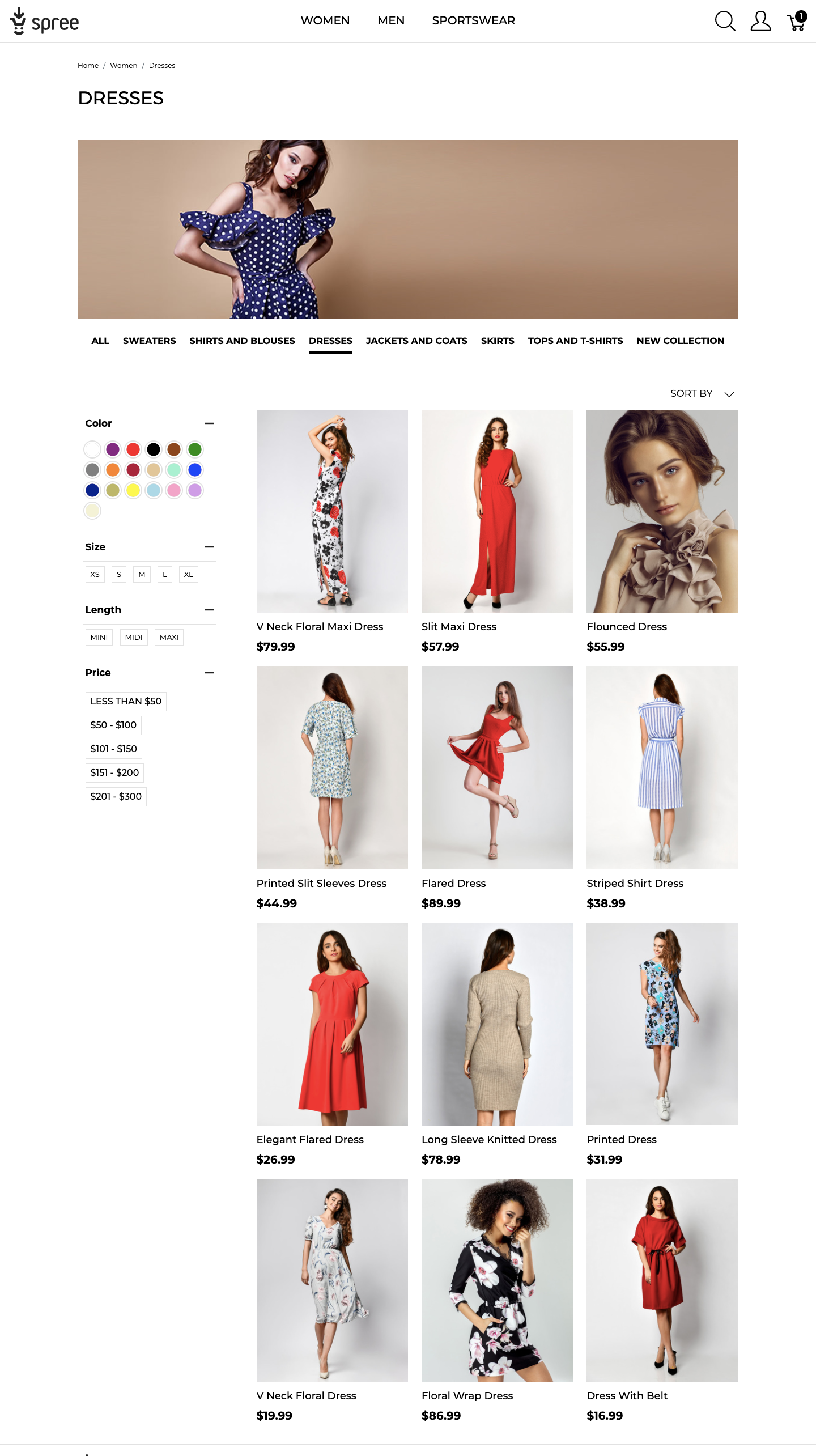
Product listing pages are either category pages or the results of internal search. They play the role of a catalog because they actually display all products inside a category or after a filter is applied.
The elements of a PLP that you should pay special attention to are: the header, number of products per row, size of images (thumbnails), the volume of information as well as sorting options (filters).
-
- Product Detail Page (PDP)
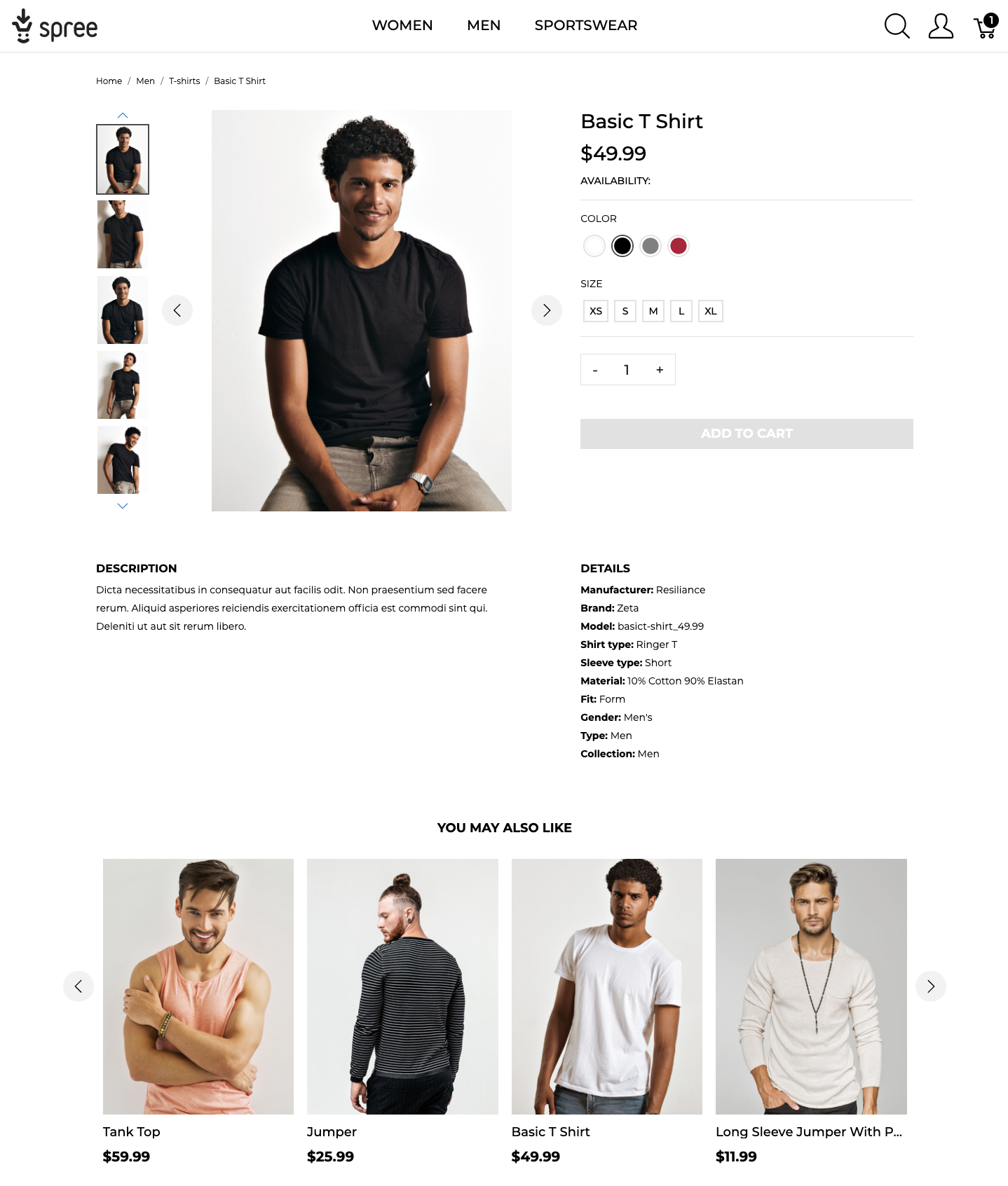
While every step along the customer’s journey is important, this is the place, where the user determines whether to purchase your product or keep looking. Having said that, a PDP should do three things:
- Give detailed information about the product and its benefits to the customer
- Offer an easy and obvious way to purchase it (add to cart and proceed in the buying process)
- Provide alternative suggestions (recommendations) in case it is not exactly what the user is looking for
-
- Checkout
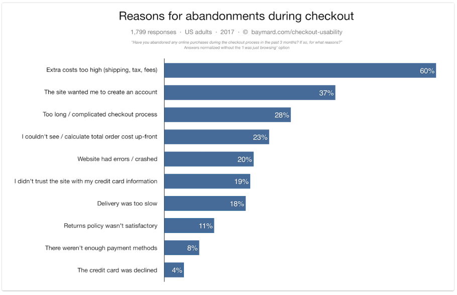
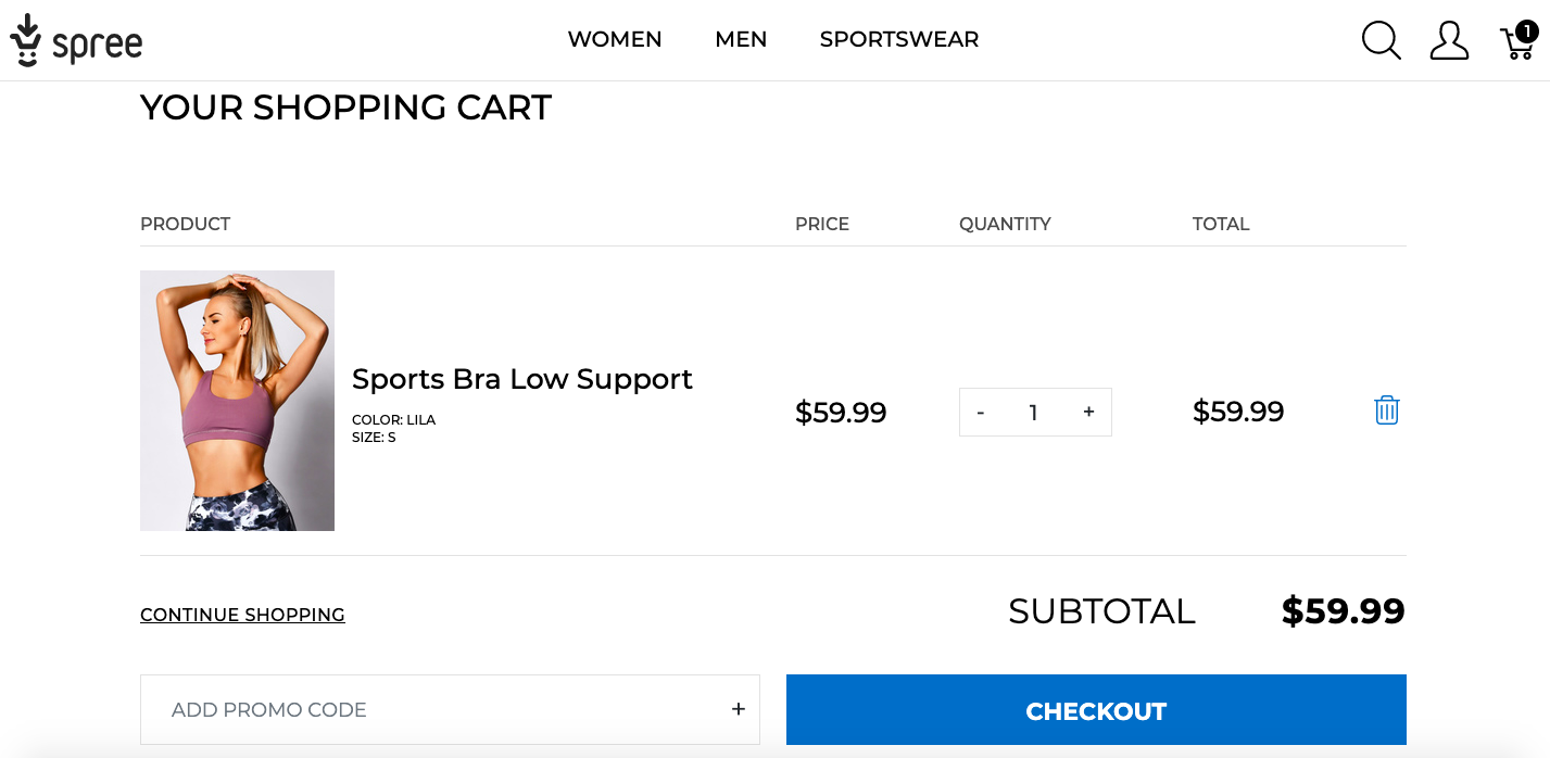
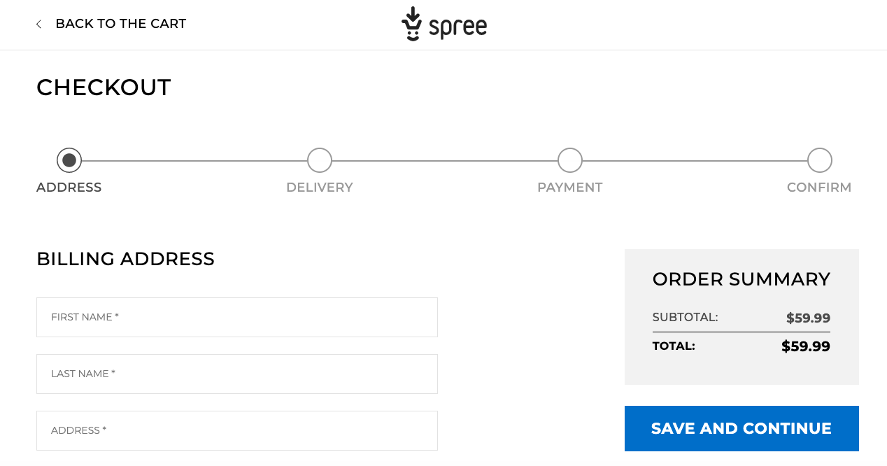
For many users checkout is the most frustrating part of the online shopping experience. It’s like having to wait in a long line to the cash register in a brick and mortar store. This explains why the cart abandonment rates are so high in many ecommerce businesses.
That is why your store should have a smooth checkout flow that customers can see and the form fields should be as minimal and clear as possible.
Tip: You can use ready-made solutions such as the new Spree online store UX. We did the work for you. It was developed in over 6 months with 6000+ hours spent between 25+ core team members, tested in 3 release candidates by several community testers providing feedback and contributing. It can be easily customized and saves you hundreds of hours of dev and QA work.
- Speed
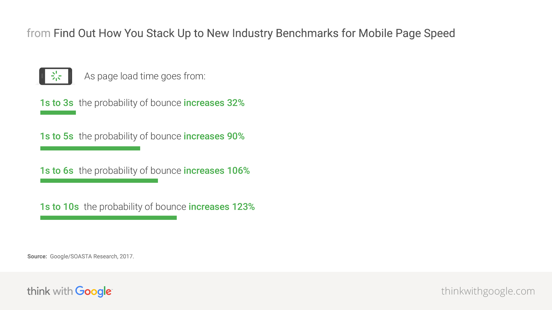
All the UX design efforts are for nothing if your website is too slow. When people have to wait for the content to load, they tend to switch their attention to the gruesome fact of waiting, not the task they wanted to complete.
People engage more with a site and definitely have a better experience when they can move freely and focus on the content instead of on their wait time.
To see how important it is, check out the success story of FCP Euro, a company that boasts to have page load times over 100x faster than any competitor.
- Stand out from the crowd
Some online stores are hard to forget and worth sharing; online showrooms, product builders, birthday reminders, personalized gift cards are only a few examples of outstanding features offered by Spree Commerce stores.
Ecommerce UX trends
- Mobile-first design
Mobile-first, as the name suggests, means that we start the website design from the mobile end which has more restrictions, then expand its features to create a desktop version.
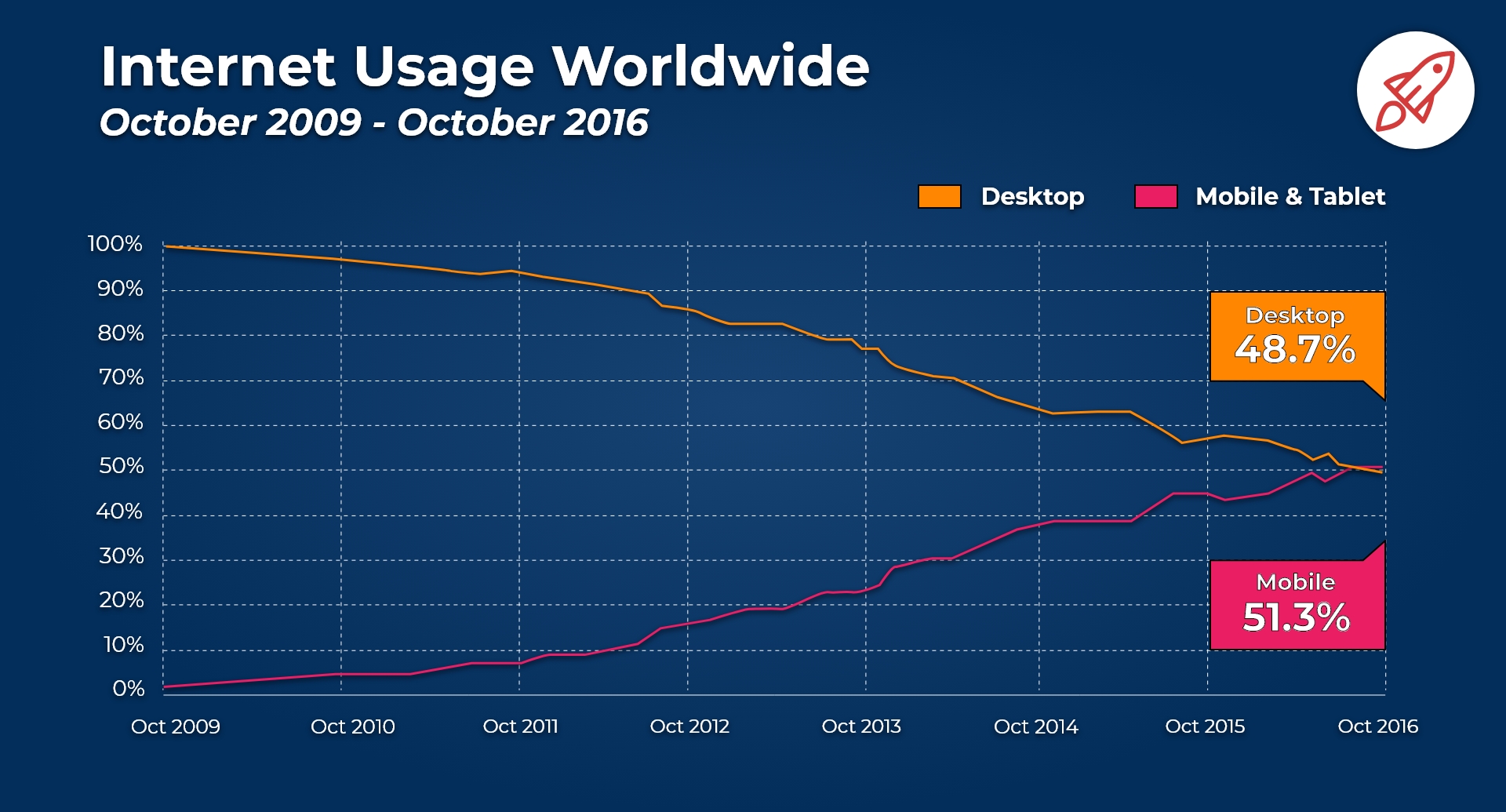
But why is it so important? Mobile internet usage has surpassed desktop already in 2016. What is more, Google announced that it will be switching to mobile-first indexing for all websites starting September 2020. This means that everyone who stays behind, shouldn’t be surprised by a significant drop in traffic when that comes into force.
This is exactly why, while designing the new Spree Commerce layouts, we took the mobile-first approach. You can see the results here.
- Personalization
81% of consumers want brands to get to know them, and understand when to approach them. A personalized approach will definitely improve the experience on your website, provided that it is done in the way that is desired by the users.
-
- Personalized view
This can be achieved already on the homepage. You can choose to display a different main banner or set of products to the users depending on their gender (e.g. Women’s and men’s clothing), location (language, preferred currency, clothes depending on the weather), etc.
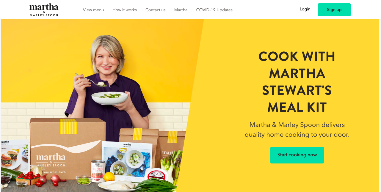
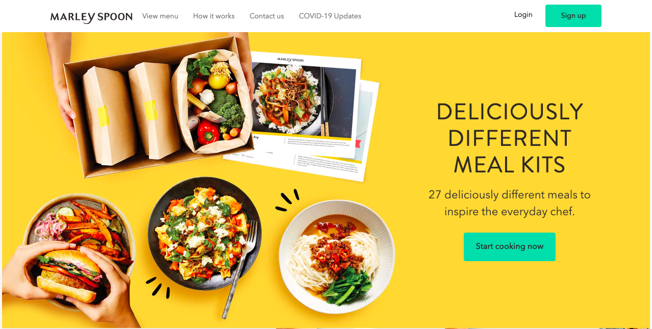
For example Marley Spoon, a meal kit delivery service featuring Martha Stewart’s award-winning recipes, will welcome its US users with a different homepage than the Australian ones. This is probably the effect of research and A/B testing on what works best in those markets.
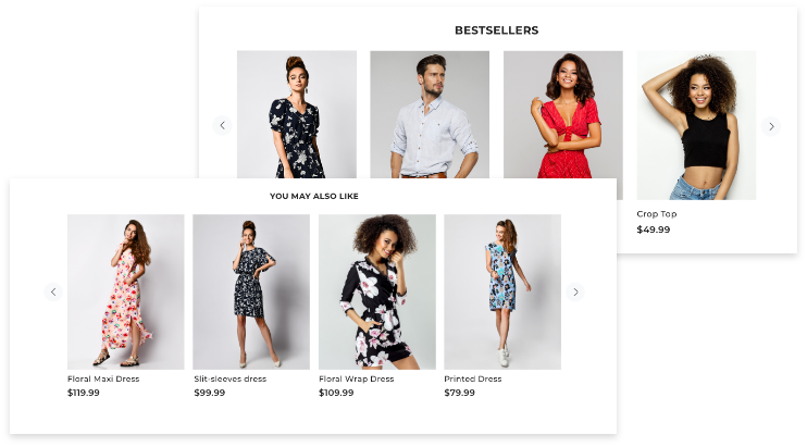
Product recommendation is another element that you can use to your advantage. This can result in upselling or cross-selling or just help the customer find what they’re looking for. But only if you show them relevant products based not only on demographics but also their browsing history on your website.
-
- Personalized product
A product tailored to the customer’s needs. It can be achieved both by offering them the right fit for their needs or letting them customize it according to their taste. Here are a few examples of brands using different approaches to offering a personalized product to their customers:
Hundred offers personalized vitamin mixes, selected based on the short survey that you are asked to fill in.
Ratio Clothing uses its own fitting algorithm to determine the right size of your made-to-measure shirt.
21diamonds lets you customize rings (or other pieces of jewelry) for your loved ones.
- Better B2B experience
When designing a B2B ecommerce, one should never forget that it is not companies but people who make the decisions. And what they want is a simple shopping and shipping procedure without lots of paperwork. That is why B2B ecommerce trends are changing and B2B retailers are starting to shape their services so that they’re more in line with the B2C model.
The goal of a B2B ecommerce should be to understand the businesses they sell to as well as the people behind them and streamline the buying process into a few easy, understandable steps in order to facilitate quick purchases.
A few examples of B2B ecommerce businesses doing it right:
Nuherbs – a wholesale B2B ecommerce platform with a custom mobile-first UX tuned for repeat customers but also friendly to first-timers.
Packhelp – a B2B web-to-print ecommerce platform that makes it super easy for anyone to order fully custom-branded packaging.
3form – B2B product sample ordering streamlined with an embedded cart and checkout.
To sum up, UX is a vital factor for ecommerce business success. Your website needs to make a good impression fast and evoke the desired emotions in your customers. However, since customers value familiarity and ease of use, there’s no need to reinvent the wheel. A ready but tested and proven solution can save hours of prototyping and development as well as reduce the overall cost of development and then maintenance.
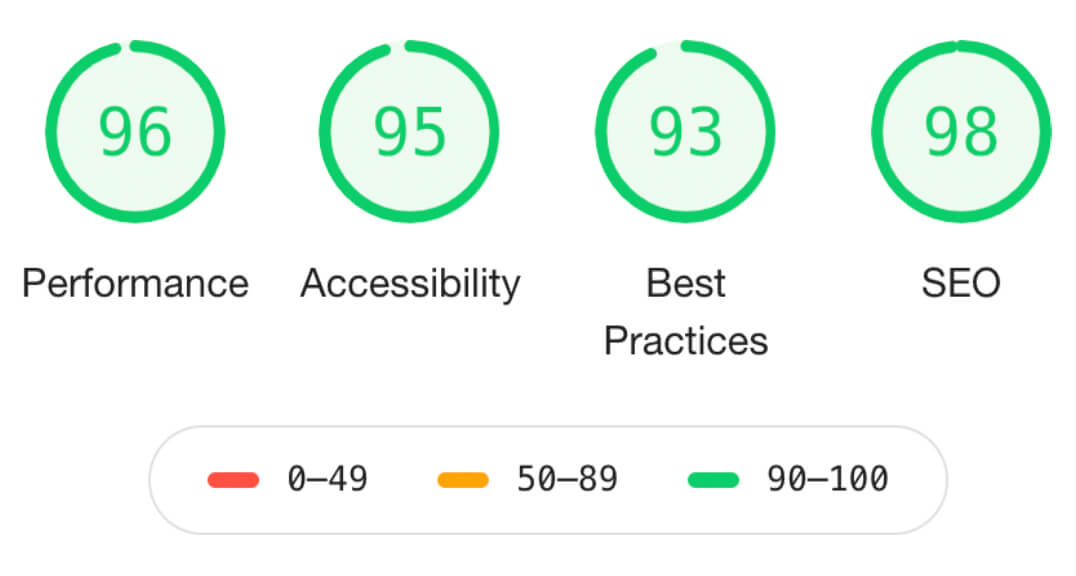
The new mobile-first Spree 4 UX enables easy layout customization, amazing performance tested with Google Lighthouse, superior SEO, and improved business KPIs such as mobile conversions, reduced bounce rates, or increased organic search traffic. Whether you need to launch a new ecommerce website or redesign an existing one, you should check it out. It’ll save you a lot of time and money.

