Huckberry redefines eCommerce for the outdoor adventurers with Spree, storytelling and data-driven marketing
Style, storytelling and authentic product
SPREE SUCCESS STORY
Huckberry, which is described as “equal parts store, magazine and inspiration”, was founded by friends Andy Forch and Richard Greiner in 2011. They wanted to create a shopping and lifestyle experience for young men like themselves who lived in the city but had a passion for the outdoors. They bootstrapped Huckberry with their savings to bring a unique company to life. It now offers a wide selection of apparel, outdoor gear, home goods and accessories from a variety of brands on its e-commerce platform to support the lifestyle of the urban adventurer.
Huckberry has grown rapidly, eclipsing $15 million of revenue in under 5 years since its inception. Moreover, it has created a new paradigm for e-commerce sites, driving growth by curating high-quality products and by developing meaningful, newsletter-driven relationships with customers and business partners.
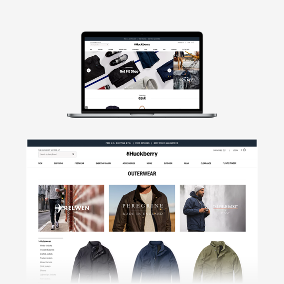
Landing pages that tell stories
For an eCommerce retailer like Huckberry, a high-converting landing page can mean the difference between a purchase and a cart abandonment.
“We A/B test everything. Images, copy, layout, format, color… everything. It doesn’t matter if we’re designing a landing page for a product or a piece of content, we always ask: what grabs the user’s attention?” – Huckberry
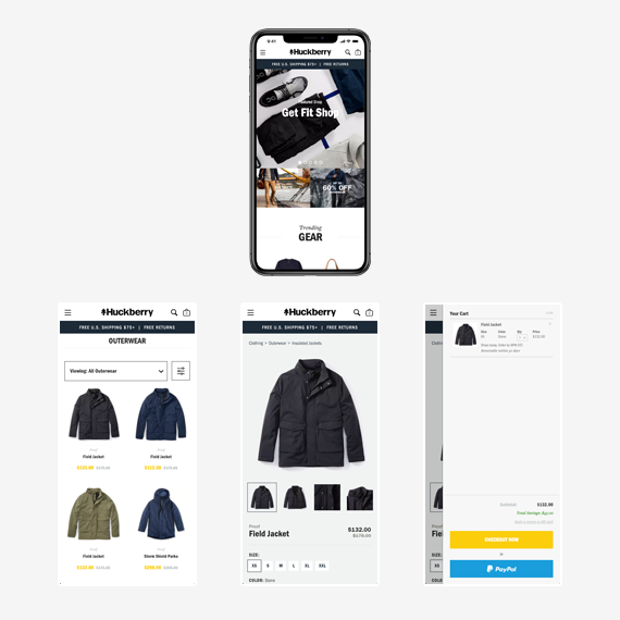
What makes their landing pages great:
- Clean, organized
- Minimalist
- Clear offer (value)
- Beautiful imagery
- Captivating, useful content
- Customer service option
- Mobile friendly
The great shopping experience is complete when after clicking “Checkout Now”, users are directed to a simple, clean, and minimal checkout page allowing to make their purchase quickly and get on with their day.

Huckberry & Spree
It all started pretty simple:
So we hustled. Working out of our apartments, we read Photoshop for Dummies cover to cover, and designed Huckberry 1.0. Our friend’s younger brother, Jimmy, helped code it between classes during his junior year at UC Berkeley. Our first website wasn’t pretty, but it worked, and as a mentor once told us, you always throw out your first pancake. – Huckberry
Huckberry is now an eCommerce platform that gets more than 7 million monthly pageviews. The company uses Braintree as its payment gateway and Spree Commerce for a customizable platform and UX. Greiner called it “easy and inexpensive to get an e-commerce store off the ground.”
Huckberry uses React and Redux for building dynamic, interactive UI and Heroku for deploying and scaling applications.
Tech Stack:
- Spree
- Ruby on Rails
- React
- Redux
- SCSS & CSS
- SQL
- JavaScript
- HTML
Conclusions:
SPREE SUCCESS STORY
Huckberry is an eCommerce site dedicated to inspiring “more active, adventurous, and stylish lives” through exclusive sales, story-telling, and a unique customer experience.
It is also a bootstrapped startup that has grown rapidly, covering US $15 million of revenue in under first 5 years. For their ‘email driven retail’ model of business, Spree has played a critical role by allowing them to customize all the important pages and the website flow, driving sales merely with the emails leading to their impressive product pages.


