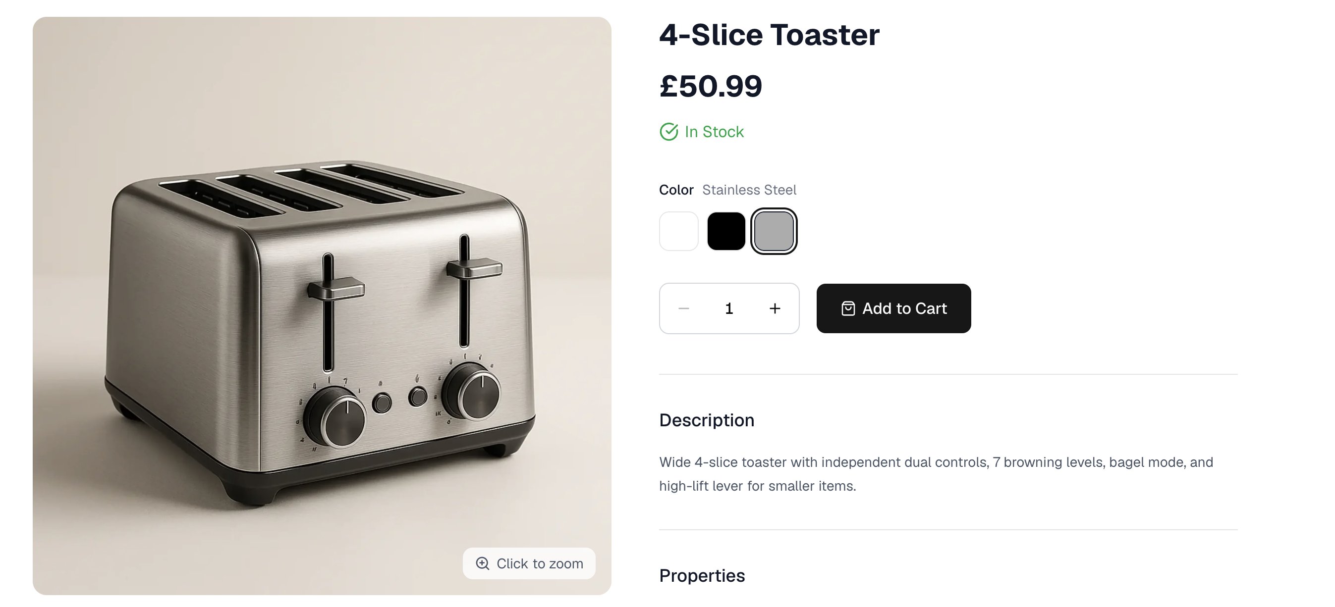

An option is a choice a customer makes on a product page, such as Size or Color, and its values are the answers, such as Small, Medium and Large. A product that uses an option gets one variant for each value you pick, and the customer chooses between them on a single product page. Options are set up once for the whole store and reused. Defining Size with S, M and L means every shirt, every pair of gloves and every rug you sell can draw on the same three values, so a product that comes in those sizes takes seconds to set up and your catalog describes sizes one way throughout. That consistency is what makes options worth defining centrally rather than per product. Customers can filter a listing by an option only when every product uses the same values for it, and a report on what sells in Large is only possible when Large means one thing across the catalog. To manage options, navigate to Products → Options in the admin dashboard.

Reviewing Option Types
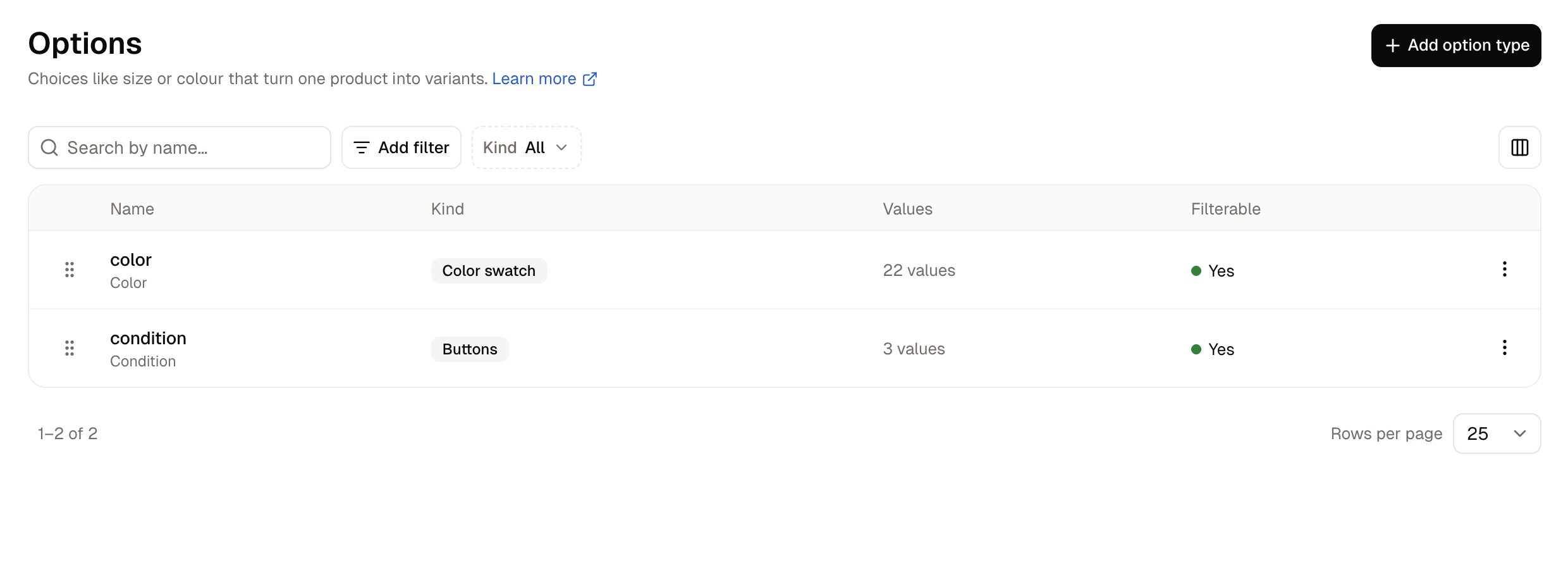
The Options screen listing the store's option types The list shows one row per option, with the internal name above the label customers see. Search by name to find an option, and narrow the list with the Kind filter or by when an option was created or last updated. Columns adds the two date columns to the list. Drag a row by its handle to reorder the list. The menu at the end of each row holds Edit and Delete.

How to Create an Option Type
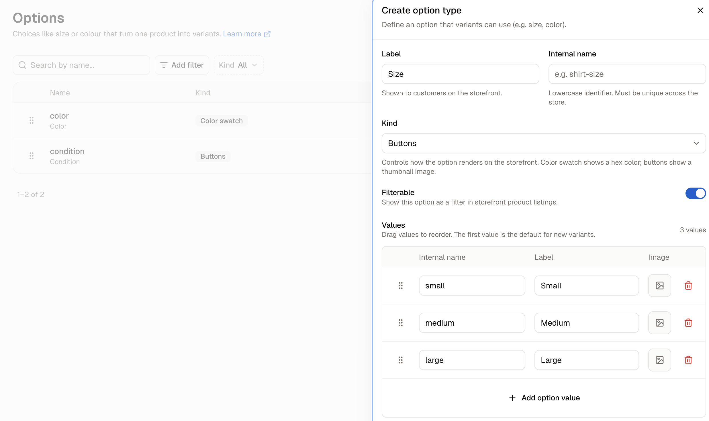
The Create option type panel Click Add option type. A panel opens with these fields:
  • Label - The name customers see on the storefront, such as Shirt size.
  • Internal name - A lowercase identifier for your own records, such as shirt-size. It has to be unique across the store, and it is not filled in from the label, so type it yourself.
  • Kind - How the option is shown to customers. Dropdown is a list, Color swatch shows each value as its color, and Buttons shows each value as a button with a thumbnail.
  • Filterable - Whether the option appears as a filter in storefront product listings. New options start with this off.
  • Values - The answers a customer can pick.
Click Add option value once for each value, and give each one an Internal name and a Label. A Color swatch option gives each value a Color box for its hex code and an Image button for its thumbnail. Click Create option type to save it.
Drag the values to reorder them. The first value in the list is the one a new variant gets by default, so put the most common choice at the top.

Setting Colors
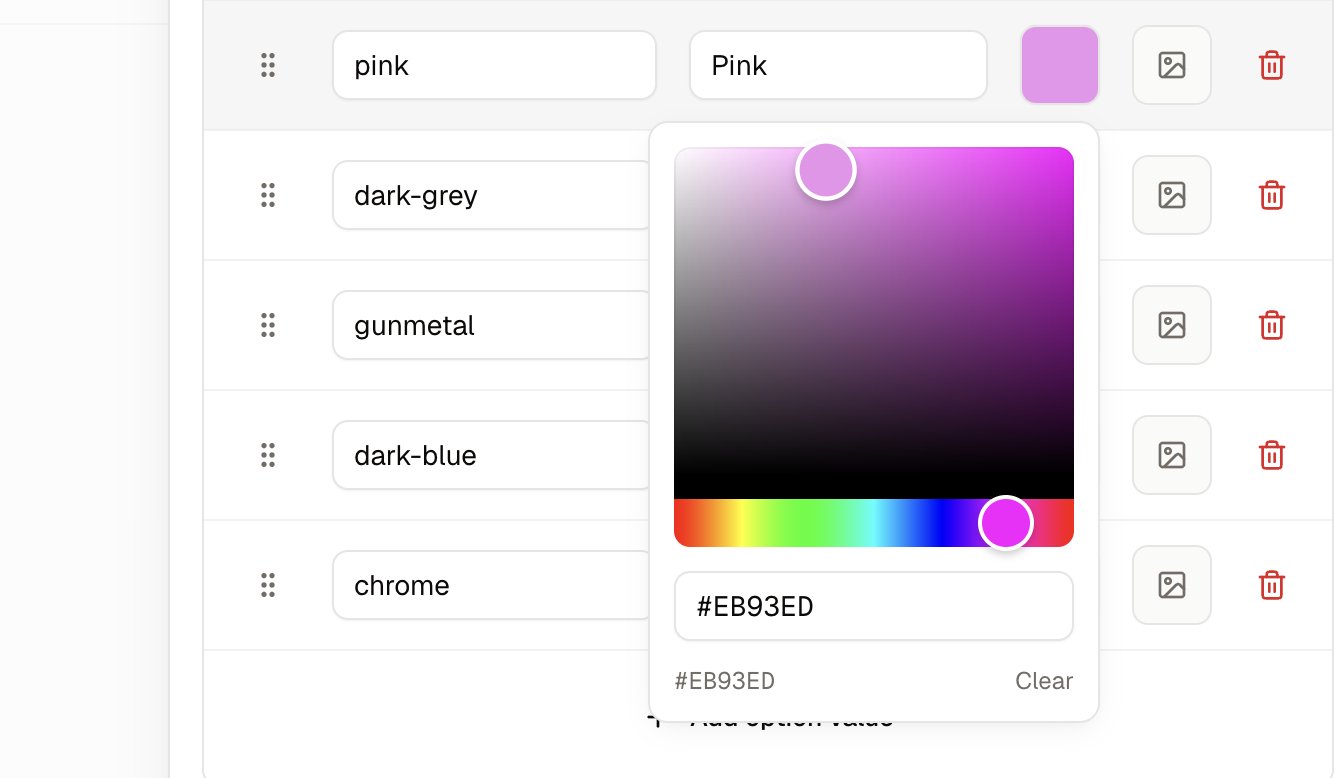
The color picker open on a value, with its color square, hue bar and hex field A Color swatch option paints each value as a block of color on the storefront, and the Color box on the value’s row is where that color is chosen. Click the box to open a picker holding a color square, a hue bar beside it and a hex field underneath. Drag within the square to choose a shade, or type a hex code straight into the field when you have one from a brand guide, such as #BB3030. The hex code is what the storefront paints, so a value left without one shows as a plain grey square and customers cannot tell one color from another. Set a color on every value of a Color swatch option. The Image button beside the Color box puts a thumbnail there instead, which suits a value a flat color cannot show, such as a wood grain or a tartan.

How to Edit an Option Type
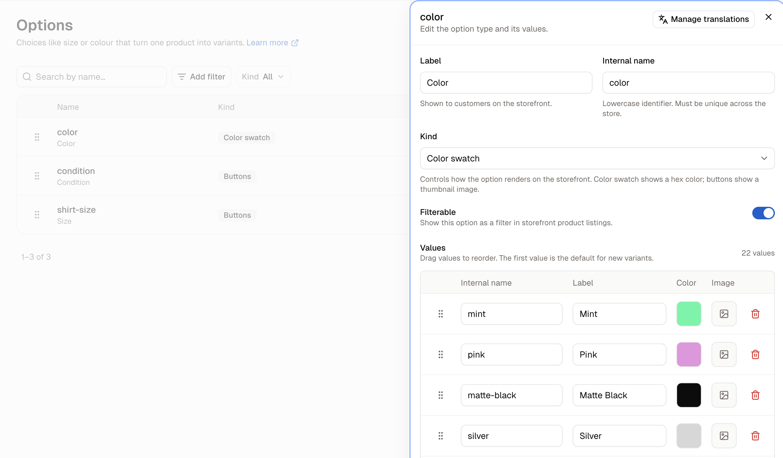
An option type open for editing, with its values listed Click an option’s name in the list, or choose Edit from its row menu. The same panel opens with its values, and Manage translations for giving the labels their wording in your other languages. Renaming a value’s label changes what customers read, everywhere that value is used, as soon as you save. The value’s internal name is untouched, so nothing else has to change: a variant carrying it shows the new label on the storefront immediately. This is how you fix a wording you have outgrown, such as Chrome becoming Chrome Polished. Adding a value makes it available to every product using that option, though it adds no variants on its own. Products only pick it up when you add it to them. Removing a value takes the row out of the list straight away, and the change is applied when you click Save.
Removing a value that variants are using does not remove those variants. Each one stays on its product, but customers can no longer pick it on the storefront. Check that no variant uses a value before you remove it.

How to Delete an Option Type

Choose Delete from the option’s row menu and confirm. Delete an option only when no product is built on it. A product’s variants are defined by their option values, so removing the option they come from leaves those variants with nothing identifying them, in the same way removing a single value does.

What Customers See

A product page on the storefront showing an option and its values On a product page, each option the product uses appears as a selector, shown as a dropdown, a set of color swatches or a row of buttons according to the option’s kind. The label beside it is the value the customer has chosen. An option marked Filterable also appears in the filters on category and search pages, so a customer can narrow a listing to one size or one color.

Further Reading

  • Variants - The versions of a product that options create
  • Adding Products - Picking an option on a product
  • Products - The products list and its filters
  • Translations - Translating option labels into your other languages