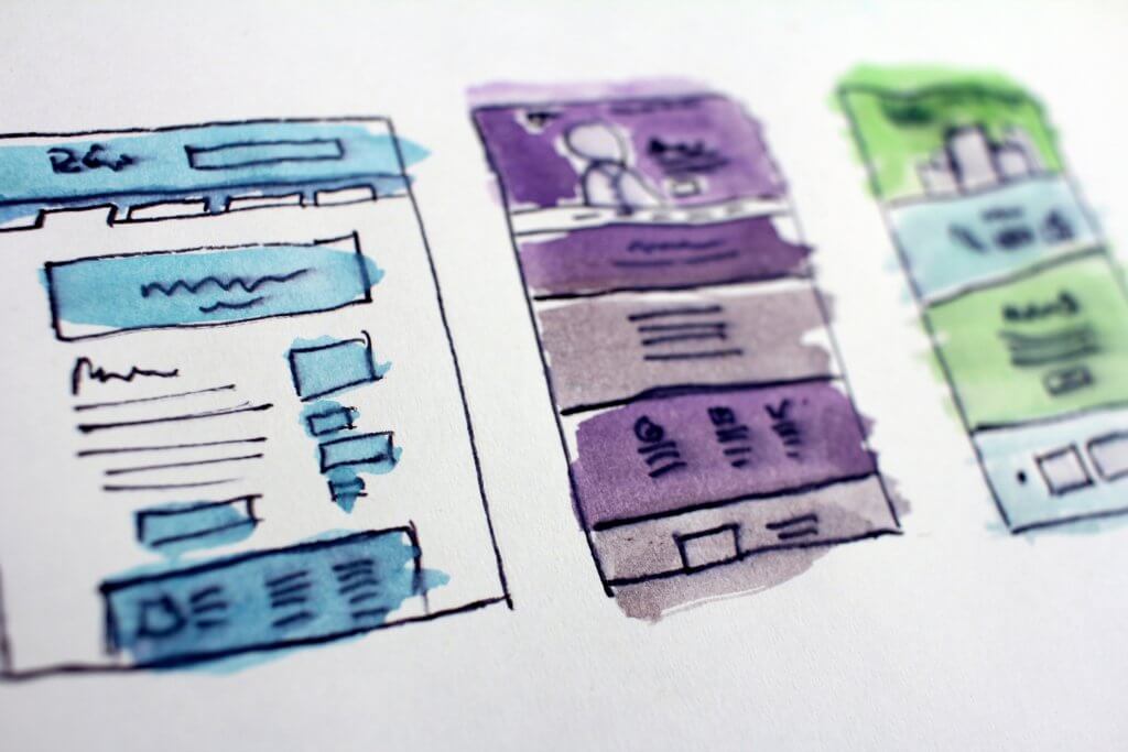
Improve your online store UX with these handy tips
When it comes to e-commerce, the aim of any site is to direct users into the right places that they need to go and to encourage them to buy a product. Good UX can achieve this in numerous ways. From the way that a signup form is crafted to the colors used in the design, UX can have the effect of boosting conversions.
Bad UX has the opposite effect in that it’s off-putting to the site visitor. Web users have become increasingly sophisticated as the net has matured and is no longer willing to deal with a site that provides a bad experience. In e-commerce sites, this means that they won’t part with their cash to pay for your products if your site UX isn’t up-to-scratch.
What exactly is UX? (and what it’s not)
In recent years, we’ve seen a renewed interest in UX (User Experience) take place, thanks largely to the need to design for smaller screens. UX is not always an easy thing to define, so let’s first look at what it is and what it’s not.
UX shouldn’t be confused with usability or UI (User Interface). While these disciplines are related to each other, UI is concerned with the actual interface with which the user interacts, while usability is all about how easy to use a site is.
UX is all about the feeling that a user has when using a site. For example, if a site is slow to load, then the user quickly becomes impatient and frustrated and will leave.
That’s bad UX.
Similarly, if a site doesn’t include white space or contrast, then it becomes more difficult for the user to interact with the site and that too is bad UX. It is quite a broad discipline, but if you get it right, it can have a significant impact on sales in your e-store.
UX design for e-commerce sites
There are a huge amount of considerations to undertake when designing an e-commerce site. Make sure you discuss all the necessary issues with your design and developers’ team when planning the site. Here are a few crucial factors to think about.
Colors
Again, use brand colors, and contrasting colors to ensure that the text is clear and easy-to-read. You should also bear in mind accessibility and consider that people with color blindness will see colors differently. For example, green and red may seem like contrasting colors, but as they appear opposite each other on the color wheel, they appear quite similar to people who suffer from colorblindness.
Buttons and other clickable areas
These ought to be immediately apparent to the user what they’re for. Remember to keep enough surrounding padding to ensure that buttons or links don’t encroach on other clickable areas that might be next to them. Mobile users will be using touch, so buttons and links should be large enough for these users to click easily. One more important tip: take a close look at the typography. It should be in keeping with your brand’s personality and should be clear and legible.
Images
An image can tell a story all by itself, so make sure yours are high quality but also optimized so that large file sizes don’t slow down the shopping experience. Include pictures that are clear and representational of the product or service. Also, keep in mind to make your website responsive, so that all visual elements are displayed well to mobile and tablet users.
White/negative space
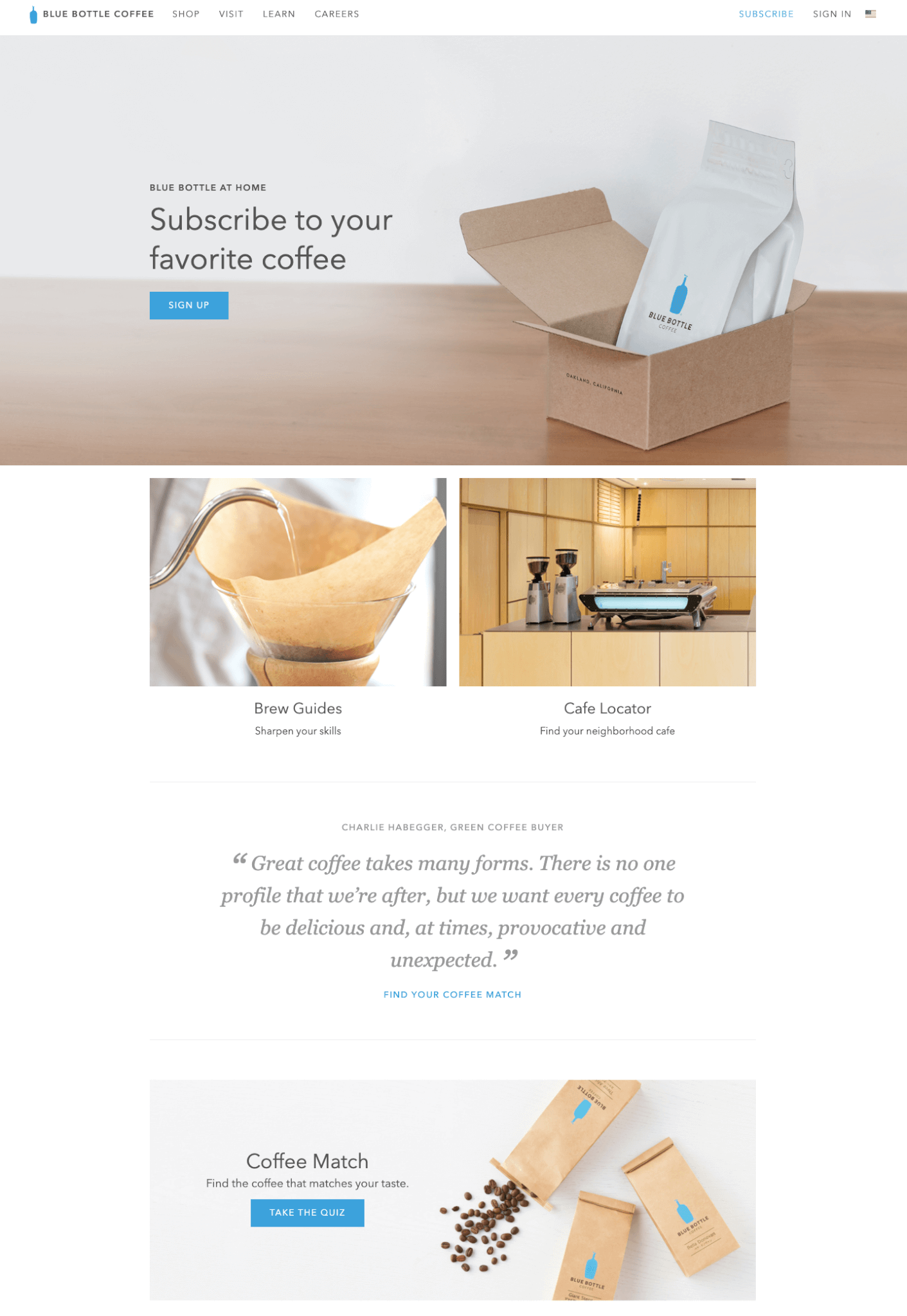
That’s an important factor many shop owners may consider difficult to digest, but white space is not a waste. It’s for the benefit of a visitor – you don’t want to get him/her tired of content overload while browsing your site. White space should be used where appropriate so that the site doesn’t appear cluttered and the central message gets lost. Take a look at this example of Blue Bottle Coffee’s website.
It’s important to remember that conventions (such as navigation being at the top of the page, and logo placed in the left top hand corner) are very useful when designing an e-commerce site. Conventions are design techniques that we’ve become so accustomed to over time that we expect to see them in sites we visit. As such, we look for them when we arrive at a site and if they’re not present, it can throw us to the extent that we leave.
With this in mind, be very careful about breaking conventions as it can also effectively ‘break’ your conversion rate. Whilst it’s sometimes tempting to be highly original and create designs that are a little off the wall, it pays to think carefully about your design choices.
Do:
- Use appropriate, contextual content to enhance checkout flow and products. Provide your customers with concise descriptions, representative pictures from different perspectives, or videos showing your product in action—depending on the item sold. Users should be left with no doubt as to what the product is and what they need to do to buy it.
- Use different colors for buttons with different purposes. You should also use color psychology to inform your choices and carry out A/B testing.
Don’t:
- Add so much content that the message is lost and the user is confused. Provide important product data first and use accordions or tabs that can be expanded on user action.
- Use long URLs – they should appear in the following format: https://www.yourshop.com/category/product for example https://www.amazon.com/George-Martins-Thrones-5-Book-Boxed/
- Place lots of text around buttons, ensure that there is just enough of negative space.
Forms and Registration
It’s important when designing forms for user registration that they require as little input as possible. Remember that you’re not just targeting desktop users and as such, some visitors will have to fill in forms on mobile. With this in mind, make sure:
- As few fields as possible are created. Only ask for the user information that you need, there’s no reason that you have to know their date of birth, for example. You can ask for more details (address, phone number, etc.) when the customer proceeds to make an order.
- Form fields are large enough for users to comfortably click into with a finger.
- Form labels appear in the right place no matter what device it’s viewed on.
Reducing the number of form fields can increase conversions by as much as 160%, so keep it simple and brief.
Key Decisions in the Design Process
When designing UX for e-commerce, the user should be central to every decision that you make. However, it’s important to remember that you are not your user and so you should carry out as much real-world user testing as possible. Consider taking a mobile-first approach too, as it’s much more difficult to pare back a desktop site for mobile than it is to design with mobile in mind from the beginning.
Now you know what factors you should draw attention to when thinking about your e-store’s UX.


