> ## Documentation Index
> Fetch the complete documentation index at: https://spreecommerce.org/docs/llms.txt
> Use this file to discover all available pages before exploring further.

# Admin Dashboard

> Learn how to customize and extend the Spree Admin Dashboard

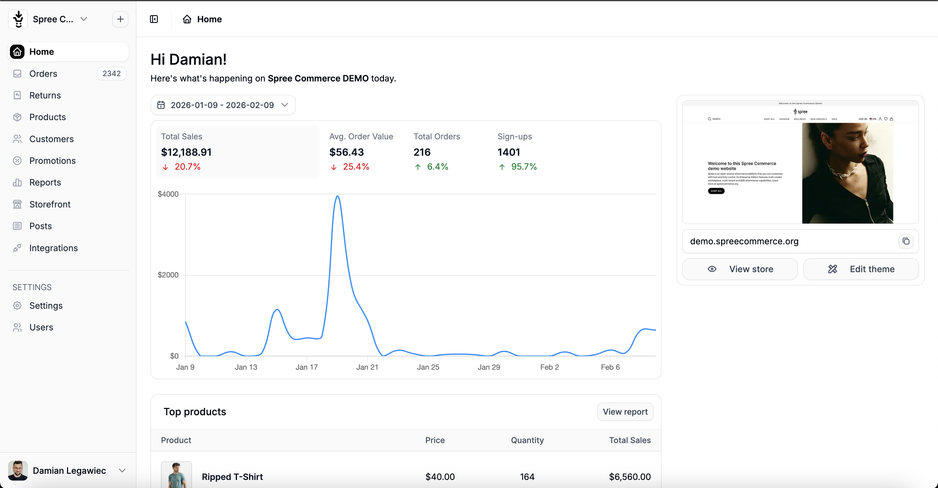
The Spree Admin Dashboard is a full-featured administration interface for managing your e-commerce store.

<Frame>
  <img src="https://mintcdn.com/spreecommerce/cQFxCIv2IPZLev6h/images/spree_admin_dashboard.png?fit=max&auto=format&n=cQFxCIv2IPZLev6h&q=85&s=effae741cd385f1dd8618eedd326449c" alt="Spree Admin Dashboard" width="3024" height="1576" data-path="images/spree_admin_dashboard.png" />
</Frame>

## What You Can Do

The Admin Dashboard allows store administrators to manage:

* **Products** - Create and manage products, variants, images, and inventory
* **Orders** - Process orders, refunds, and shipments
* **Customers** - View customer accounts and order history
* **Promotions** - Create discounts, coupon codes, and special offers
* **Content** - Manage pages, menus, and blog posts
* **Settings** - Configure store settings, shipping, taxes, and payments

## Customization Options

As a developer, you can fully customize the Admin Dashboard:

<CardGroup cols={2}>
  <Card title="Add New Sections" icon="plus" href="/developer/tutorial/admin">
    Create entirely new admin pages for custom features like Brands, Vendors, or any custom model
  </Card>

  <Card title="Extend Existing UI" icon="puzzle-piece" href="/developer/admin/extending-ui">
    Inject custom fields, buttons, and sections into existing admin pages
  </Card>

  <Card title="Custom Navigation" icon="bars" href="/developer/admin/navigation">
    Add menu items to the sidebar or create custom navigation structures
  </Card>

  <Card title="Custom Styling" icon="palette" href="/developer/admin/custom-css">
    Add your own CSS to match your brand or modify the look and feel
  </Card>
</CardGroup>

## Architecture Overview

Spree Admin follows standard Rails conventions with some Spree-specific patterns:

```
app/
├── controllers/
│   └── spree/
│       └── admin/
│           └── products_controller.rb    # Your custom controllers
├── views/
│   └── spree/
│       └── admin/
│           └── products/
│               ├── index.html.erb        # List view
│               ├── _form.html.erb        # Shared form partial
│               └── _table_row.html.erb   # Table row partial
├── helpers/
│   └── spree/
│       └── admin/
│           └── products_helper.rb        # View helpers
└── assets/
    └── tailwind/
        └── spree_admin.css               # Custom Tailwind styles
```

## Key Concepts

### Controllers

Admin controllers inherit from `Spree::Admin::ResourceController` which provides:

* Full CRUD operations (index, new, create, edit, update, destroy)
* Automatic authorization checks
* Flash messages and redirects
* Search and filtering with Ransack

```ruby theme={"theme":"night-owl"}
# app/controllers/spree/admin/brands_controller.rb
module Spree
  module Admin
    class BrandsController < ResourceController
      # That's it! CRUD is handled automatically.
      # Override methods only when needed.
    end
  end
end
```

<Info>
  Learn more about creating admin sections in the [Admin Dashboard Tutorial](/developer/tutorial/admin).
</Info>

### Views & Templates

Views use standard Rails ERB templates with Spree's [Form Builder](/developer/admin/form-builder) and [Components](/developer/admin/components):

```erb theme={"theme":"night-owl"}
<%# app/views/spree/admin/brands/_form.html.erb %>
<div class="card mb-6">
  <div class="card-header">
    <h5 class="card-title"><%= Spree.t(:general_settings) %></h5>
  </div>
  <div class="card-body">
    <%= f.spree_text_field :name, required: true %>
    <%= f.spree_text_area :description %>
    <%= f.spree_file_field :logo, width: 300, height: 300 %>
    <%= f.spree_check_box :active %>
  </div>
</div>
```

### JavaScript & Interactivity

Spree Admin uses [Hotwire](https://hotwire.dev/) (Turbo + Stimulus) for interactivity:

* **Turbo Drive** - Fast page navigation without full reloads
* **Turbo Frames** - Update parts of the page independently
* **Turbo Streams** - Real-time updates over WebSocket
* **Stimulus** - Lightweight JavaScript controllers

```erb theme={"theme":"night-owl"}
<%# Using Stimulus controllers %>
<div data-controller="dropdown">
  <button data-action="dropdown#toggle">Menu</button>
  <div data-dropdown-target="menu">...</div>
</div>
```

<Info>
  Add custom JavaScript using [Stimulus controllers](/developer/admin/custom-javascript).
</Info>

### Styling

The Admin Dashboard uses [Tailwind CSS v4](https://tailwindcss.com/) for styling. You can:

* Use Tailwind utility classes directly in your views
* Override theme variables (colors, spacing, typography)
* Add custom components using `@layer components`

```erb theme={"theme":"night-owl"}
<%# Using Tailwind utility classes in views %>
<div class="bg-white rounded-lg shadow-sm border border-zinc-200 p-4">
  <h3 class="text-lg font-bold text-zinc-900">My Custom Card</h3>
  <p class="text-sm text-zinc-600 mt-2">Card content here</p>
</div>
```

<Info>
  Learn how to customize styles in [Custom CSS](/developer/admin/custom-css).
</Info>

## Quick Reference

### Available Tools

| Tool           | Purpose                                 | Documentation                                     |
| -------------- | --------------------------------------- | ------------------------------------------------- |
| Form Builder   | Create consistent forms with validation | [Form Builder](/developer/admin/form-builder)     |
| Components     | Dropdowns, dialogs, icons, badges, etc. | [Components](/developer/admin/components)         |
| Helper Methods | Navigation, links, utilities            | [Helper Methods](/developer/admin/helper-methods) |
| UI Extensions  | Inject content into existing pages      | [Extending UI](/developer/admin/extending-ui)     |

### Common Tasks

| Task                   | How To                                                                      |
| ---------------------- | --------------------------------------------------------------------------- |
| Add a new admin page   | Use the scaffold generator: `bin/rails g spree:admin:scaffold Spree::Brand` |
| Add sidebar navigation | Use `Spree.admin.navigation.sidebar.add` in an initializer                  |
| Add form fields        | Use `f.spree_text_field`, `f.spree_select`, etc.                            |
| Show flash messages    | They're automatic with `ResourceController`                                 |
| Check permissions      | Use `can?(:update, @product)` in views                                      |

### Generator Commands

```bash theme={"theme":"night-owl"}
# Generate a complete admin section (controller, views, routes)
bin/rails g spree:admin:scaffold Spree::Brand

# Generate just a controller
bin/rails g controller Spree::Admin::Brands --skip-routes
```

## Authentication & Authorization

### Authentication

Admin users must be authenticated to access the dashboard. Spree supports:

* Built-in Devise authentication
* Custom authentication adapters
* SSO integration

<Info>
  See [Authentication](/developer/admin/authentication) for setup details.
</Info>

### Authorization

Spree uses [CanCanCan](https://github.com/CanCanCommunity/cancancan) for authorization:

```ruby theme={"theme":"night-owl"}
# Check permissions in controllers
authorize! :update, @product

# Check permissions in views
<% if can?(:destroy, @product) %>
  <%= link_to_delete(@product) %>
<% end %>
```

<Info>
  See [Permissions](/developer/customization/permissions) for defining custom abilities.
</Info>

## Next Steps

<CardGroup cols={2}>
  <Card title="Tutorial: Build Admin UI" icon="graduation-cap" href="/developer/tutorial/admin">
    Step-by-step guide to creating a complete admin section
  </Card>

  <Card title="Form Builder" icon="rectangle-list" href="/developer/admin/form-builder">
    Learn all available form field helpers
  </Card>

  <Card title="Components" icon="puzzle-piece" href="/developer/admin/components">
    Explore UI components like dropdowns, dialogs, and icons
  </Card>

  <Card title="Extending UI" icon="expand" href="/developer/admin/extending-ui">
    Add custom content to existing admin pages
  </Card>
</CardGroup>
